EmpowerNet

EmpowerNet
EmpowerNet is a regional network of domestic and sexual violence providers who work together to provide comprehensive services that support and empower those who are impacted by violence. The six partner organizations work together to facilitate collaboration , sponsor innovative regionally-based programming, and ensure high-quality care for all individuals affected by sexual and domestic violence in the region.

While the teams behind EmpowerNet had collaborated for 10 years, they had yet to create a single point of access for resources and information. Creating a recognizable brand identity and a compelling, easy to use website was an important step for the collaborative to better share their message with the larger community.
The brand strategy phase brought to light key goals like clarity, consistency, and unity as well as the brand’s trailblazing and pioneering personality. This led the design team to explore a graphic identity that balances professionalism, approachability, and gender neutrality.
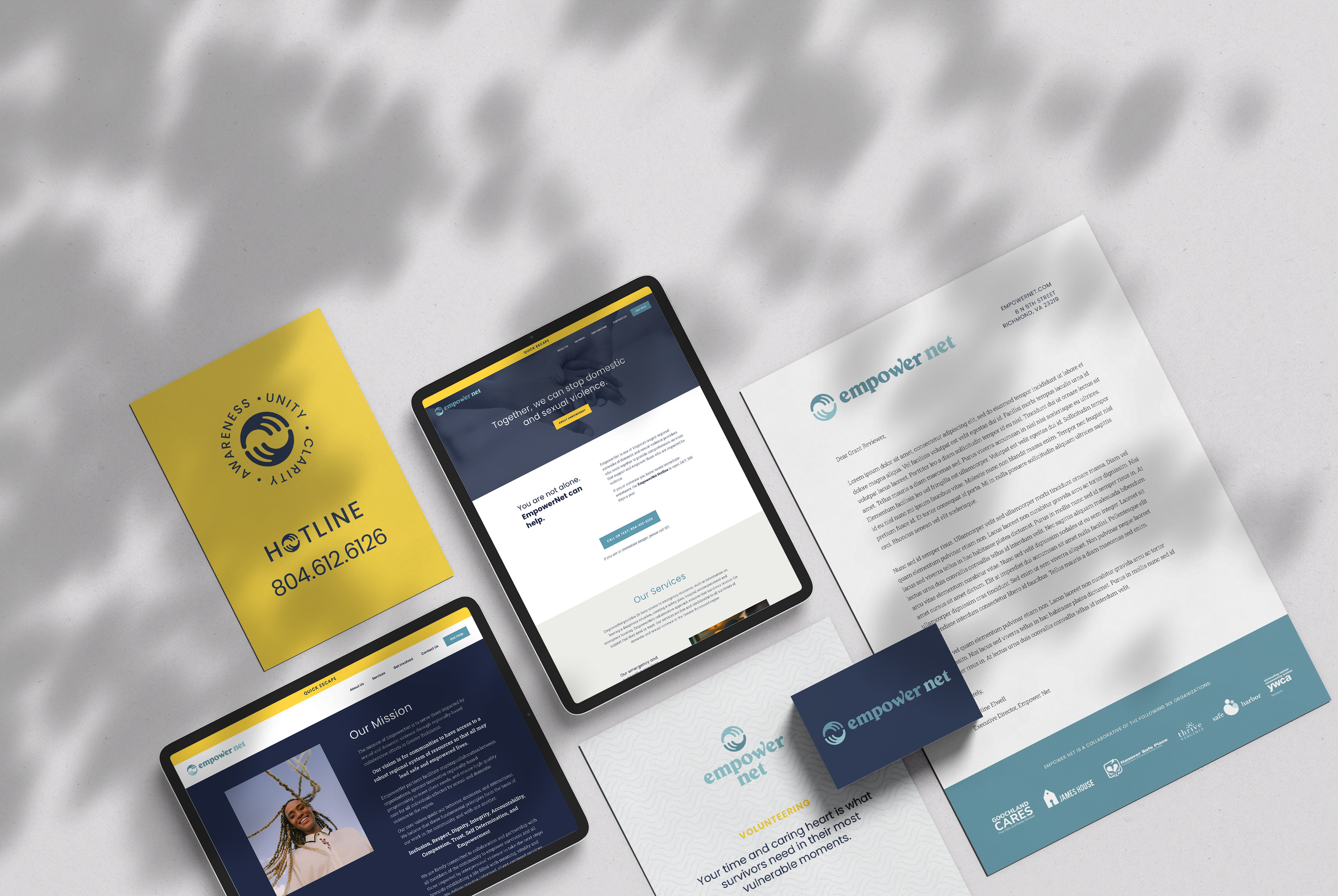
The logo mark is a simplified and abstract shape inspired by hands coming together in a supportive embrace. Each side of the circular mark has three prongs, combining to create six prongs, representing the six organizations that make up the collaborative. The letterforms are intentionally rounded and substantial so they feel both friendly and strong.
The w in empower has also been modified with an extra long stem and bold terminal, creating a subtle flag illusion and a slight nod to the emergency nature of EmpowerNet’s work.
Finally, the color palette is designed to feel gender neutral and approachable. A professional navy is balanced by softer dusty blue tones and a vibrant marigold yellow gives a pop of color for focusing the viewer’s attention on the most important information.
The final website uses strong typography hierarchy, bold color blocking, and creative content organization features to ensure partners understand the deep impact EmpowerNet has, but most importantly, individuals in need can quickly and safely access needed information and services.