Maggie Studio: A Colorful Rebrand & Website for NYC Photographers
SERVICES
Brand Identity Design
Website Design
INDUSTRY
Corporate
Maggie Studio
Maggie is a dynamic team of photographers focused on capturing the authentic joy and beauty of every person, event and brand they shoot.
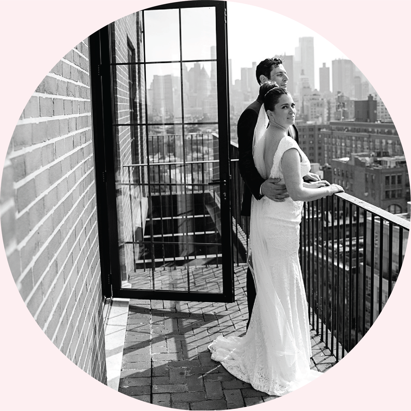
Based in Manhattan, every photographer and cinematographer at Maggie brings decades of expertise and a warm and friendly approach to ensure guests and models feel comfortable, relaxed, and ready to be themselves. From capturing spontaneous moments of intimacy between newlyweds to finding the perfect light to evoke a brand’s personality, Maggie’s work is spontaneous, authentic, and stunning.
Previously named Maggie Marguerite Photography, owner and founder Georgi Richardson found over time the brand was hard to say and spell and therefore difficult for clients to easily find her team online. The website had minimal updates since its creation over a decade ago, and didn’t show off the depth of expertise or the story of the team.
Since its inception, the business grew from just Georgi to over 8 photographers and cinematographers covering international, high-end and luxury clients. Georgi and her team needed a more professional brand experience, one that stood out in a saturated market, but one that also centered the vibrant and friendly personalities behind the camera.
The goal of the rebrand and website was to appeal to high-end private events and luxury brands as well as highlight Maggie’s highly qualified team and cinematography offerings.
We wanted to celebrate the team’s personalities and joyous approach to photography to illustrate the brand experience and values.
The new name (shortened to Maggie.), brand, and website exude the fun and joy the whole team finds in their work while still paying homage to the owner’s grandmother who is the inspiration behind the name.
The key concept behind the rebrand was to balance their incomparable professionalism and expertise with the personal approach of the team and the relationships they develop with clients. The simple addition of a period at the end of the name Maggie helped give the brand a more commercial feel and allowed the design team to integrate the dot as a central element to the brand visuals, which you’ll find sprinkled throughout the site, including the custom cursor!


