Cirrus Vodka: Breezy and Carefree Rebrand & Packaging

SERVICES
Brand Identity Design
Packaging
Web Design
INDUSTRY
Hospitality
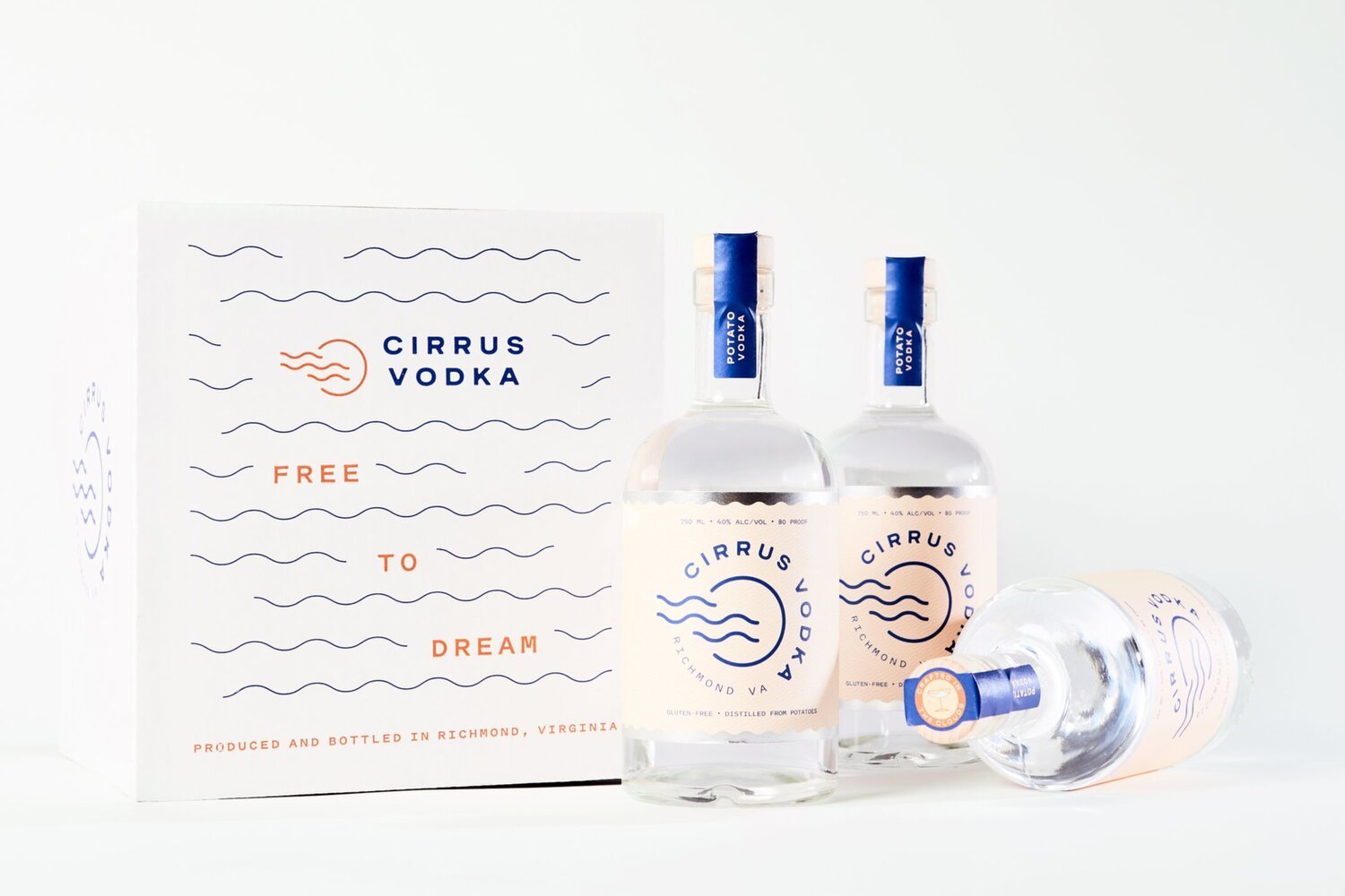
Cirrus Vodka
Delightfully sippable, Cirrus Vodka is an award winning, hand-crafted spirit distilled in Richmond, Virginia. From Sunday brunch to a backyard party to your favorite local bar, Cirrus Vodka always fits in.

Originally launched in 2003, Cirrus Vodka wanted to take their brand to the next level. The team was excited to reintroduce the Richmond-made craft beverage to locally minded and engaged consumers.


The graphic identity for Cirrus Vodka introduces a fun loving brand personality and premium focus into the logo and packaging through a new modern icon, bold typography, and a refined color palette.
The simplified mark infuses meaning into the logo, alluding to the namesake Cirrus clouds on a sunny day and doubles as a birds eye view of a delicious cocktail flowing into your glass.
The new logo proudly represents Richmond, Virginia in the main icon, anchoring the brand story to its origin story and the local craft beverage scene.
The new signature packaging leads with Cirrus’ bold new blue logo on a backdrop of a light and playful wavy pattern, edged with metallic silver foil. The new Cirrus bottle is refined with a modern twist, perfectly fitting in over brunch cocktails, backyard parties, or your favorite local bar.