HBA Architecture + Interior Design

SERVICES
Brand Strategy
Brand Identity Design
INDUSTRY
Design
AEC
HBA Architecture
+ Interior Design
HBA is a design firm built on the principles of service. For over five decades, they've created impactful architecture and interior spaces through collaborative, community-focused partnerships. Clients trust HBA for their creative problem-solving, people-first approach, and meticulous documentation. At their core, the firm is committed to listening deeply, providing insightful guidance, and being a reliable partner at every stage of the process.
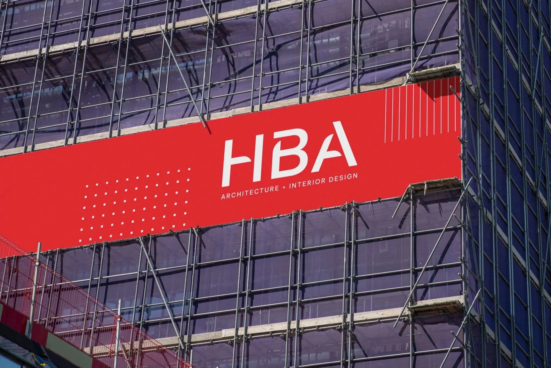
After 50 years, HBA was ready for a visual identity that better reflected their evolution, one that felt as forward-thinking and approachable as the team behind it.
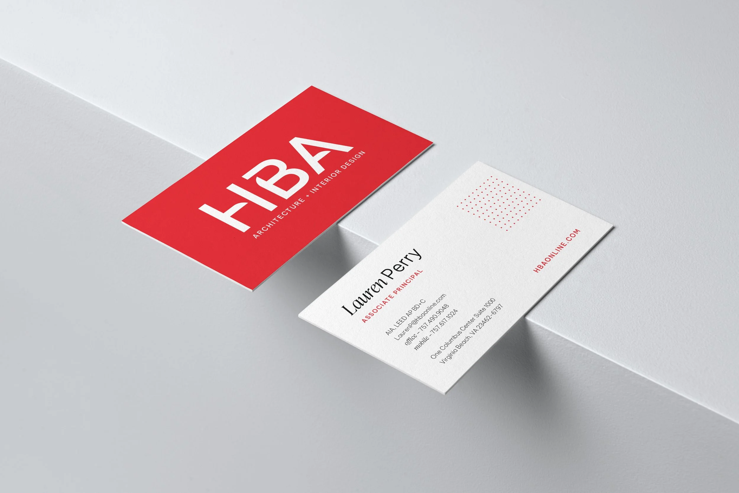
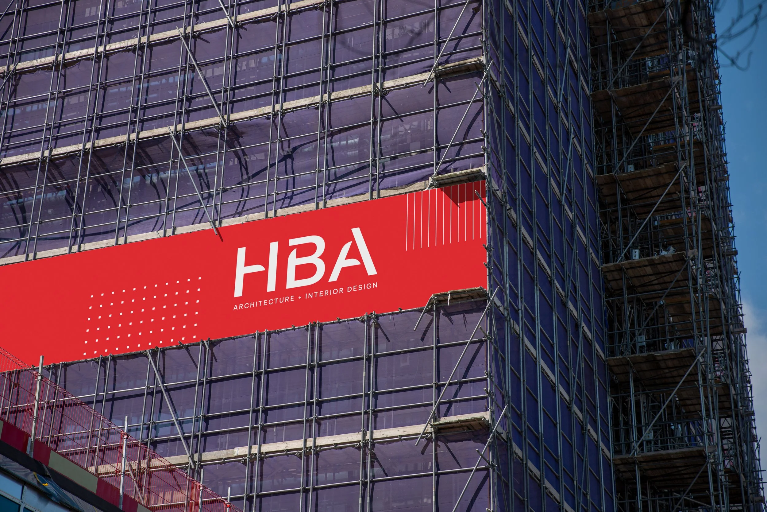
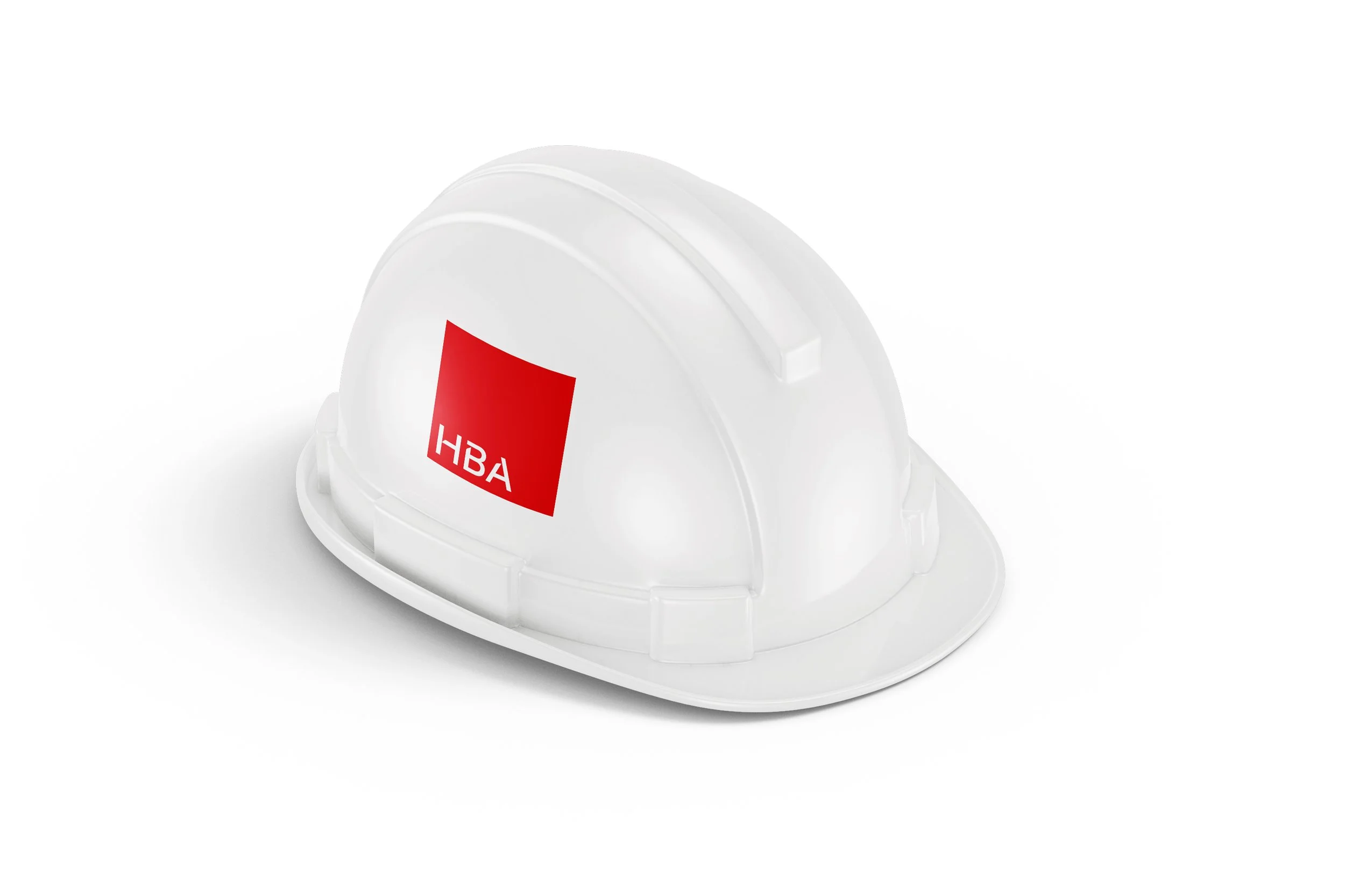
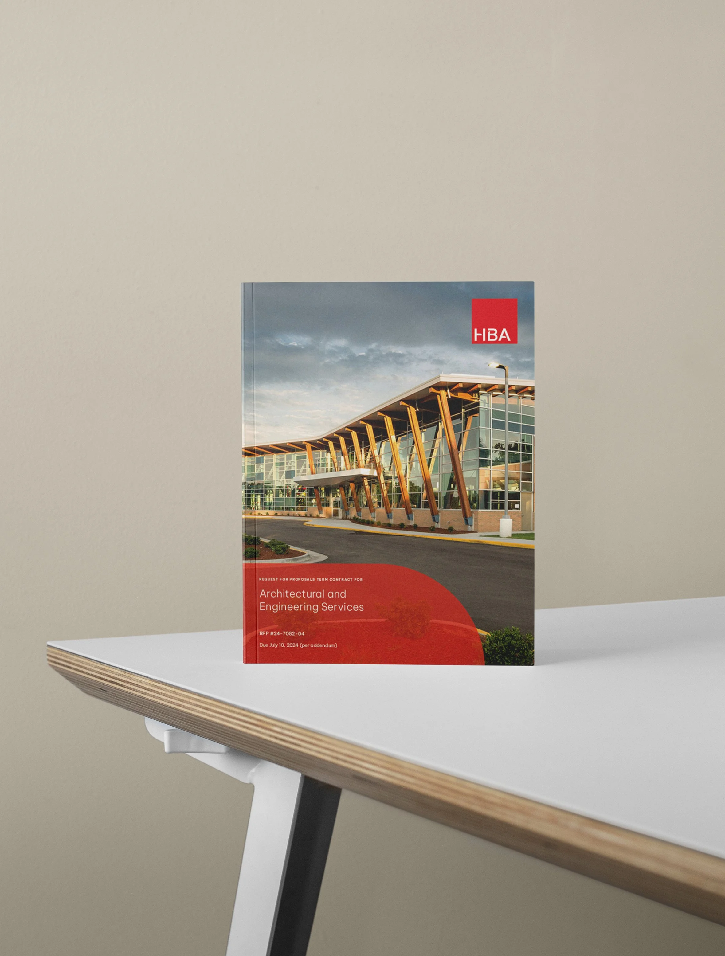
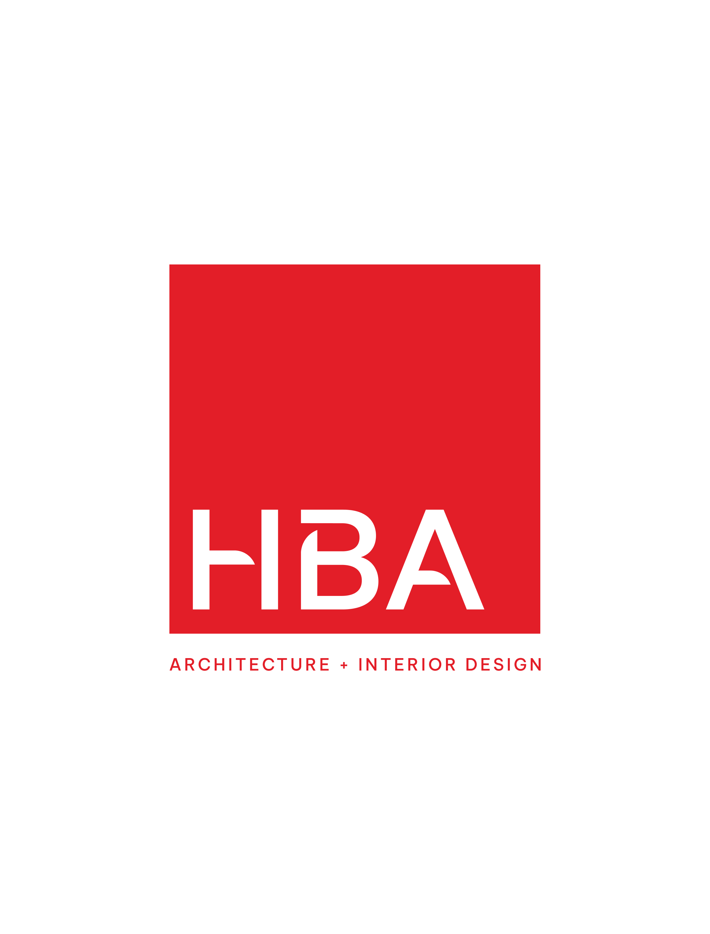
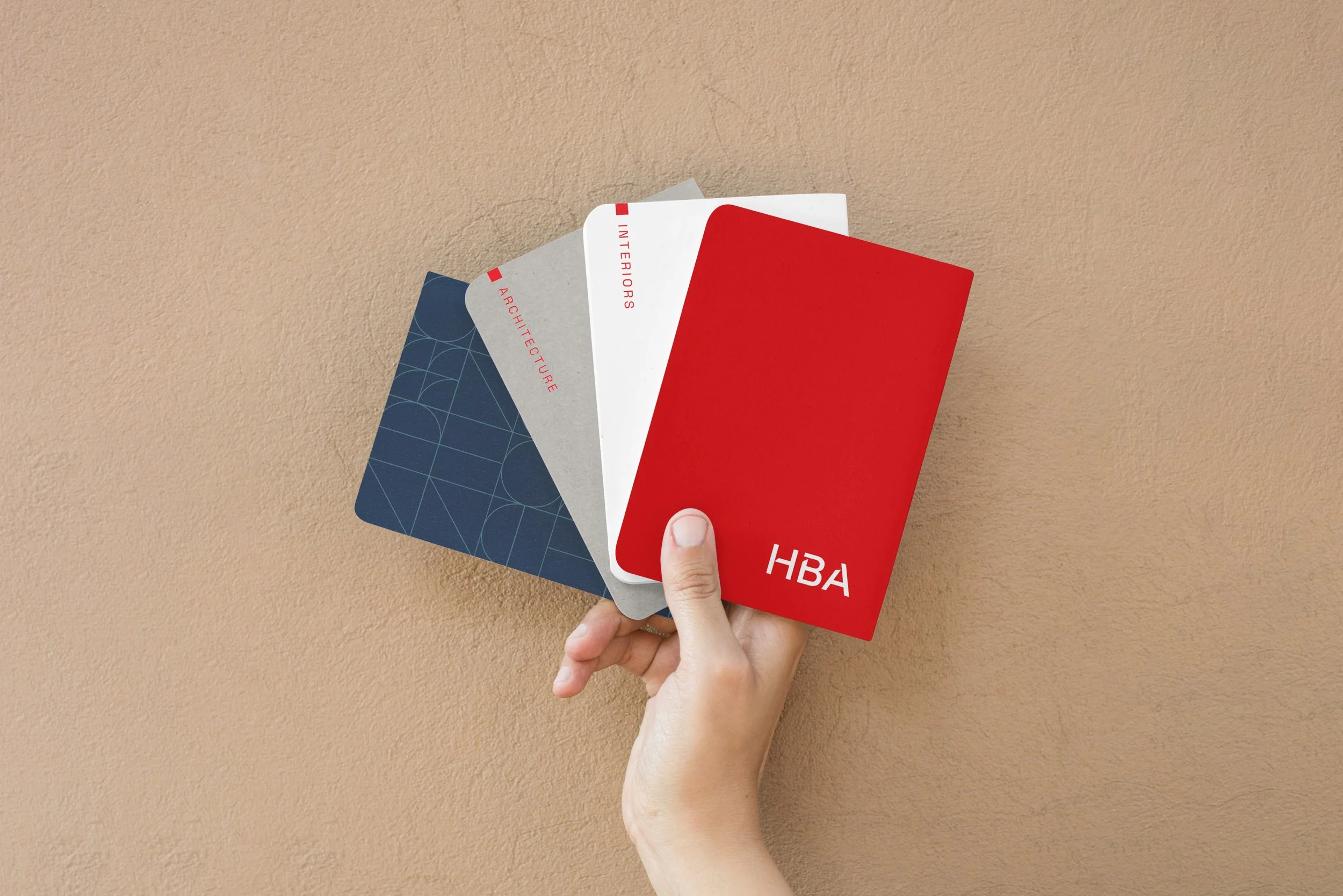
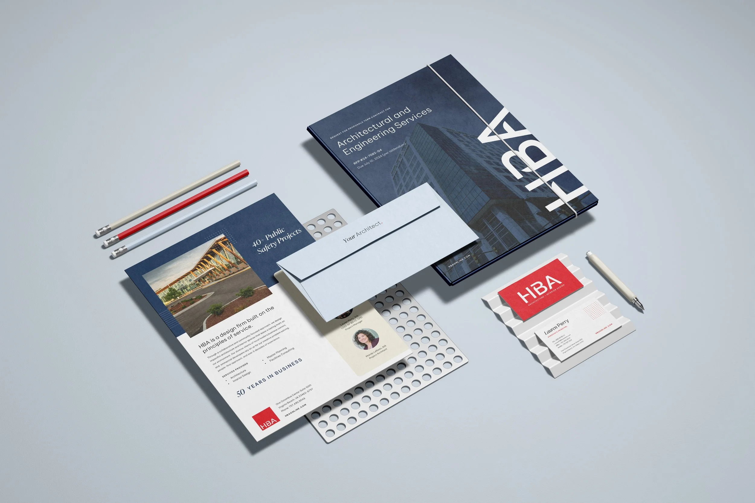
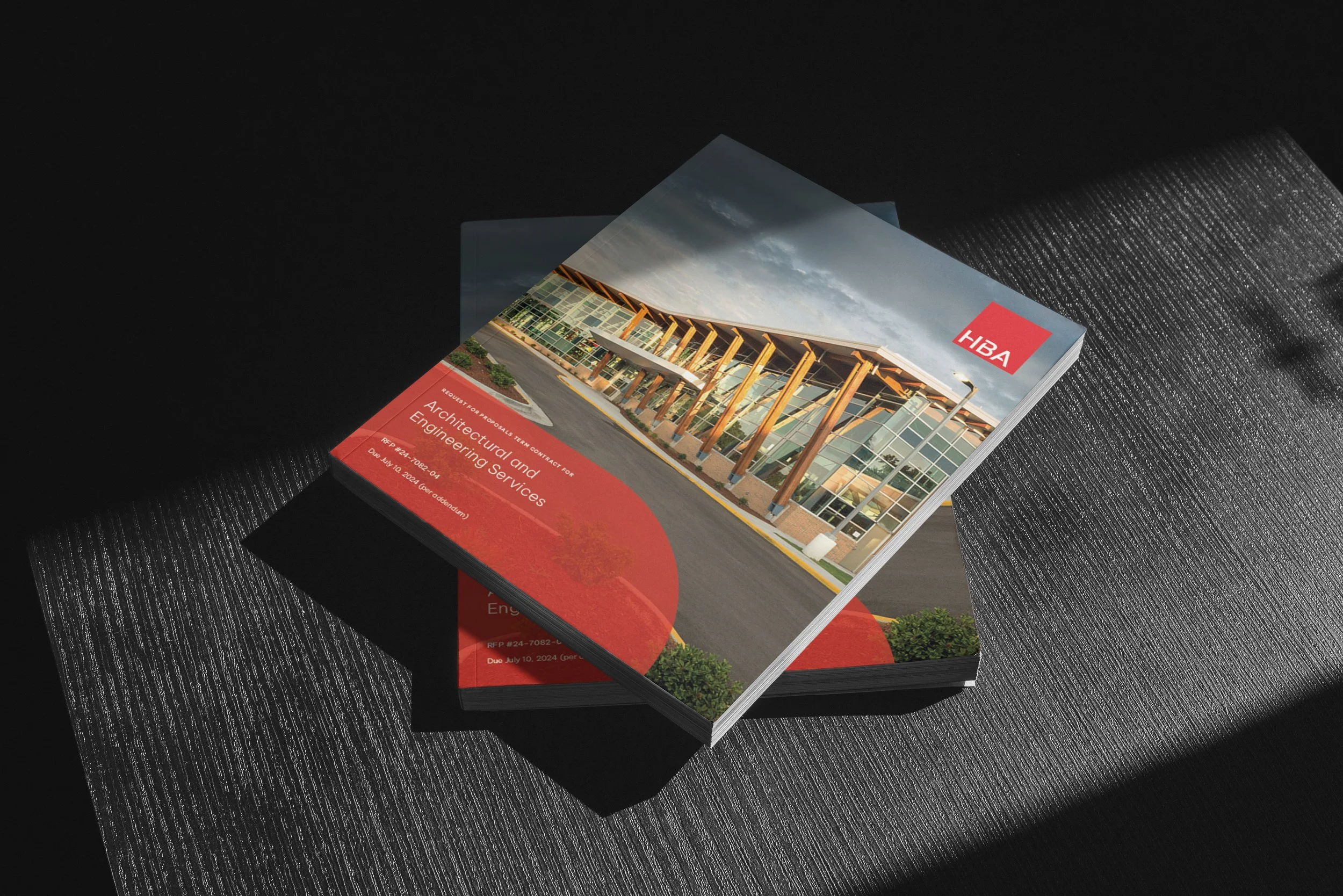
The updated wordmark takes an elevated, modern approach to their initials while keeping things minimal and clean. Angled cutouts create depth, shadow, and a sense of movement within the letterforms. There's a deliberate balance of sharpness and softness in the type, reflecting a firm that's both precise in its craft and genuinely approachable in its partnerships. The original HBA mark lives on as a submark within a square, maintaining a through line to the brand's history.
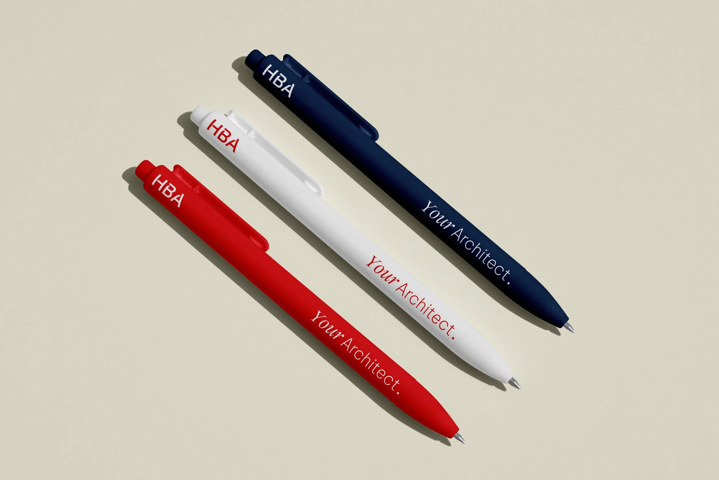
The color palette reinforces that shift in tone. A vibrant cardinal red anchors the system, paired with warmer neutrals and a soft mint green to bring a humanistic feel to the brand. It's confident yet inviting and creates a system that’s versatile without losing its edge.