The Flora
SERVICES
Brand Identity
Interior Design
Signage Design
INDUSTRY
Real Estate Development
Multifamily
PARTNERS
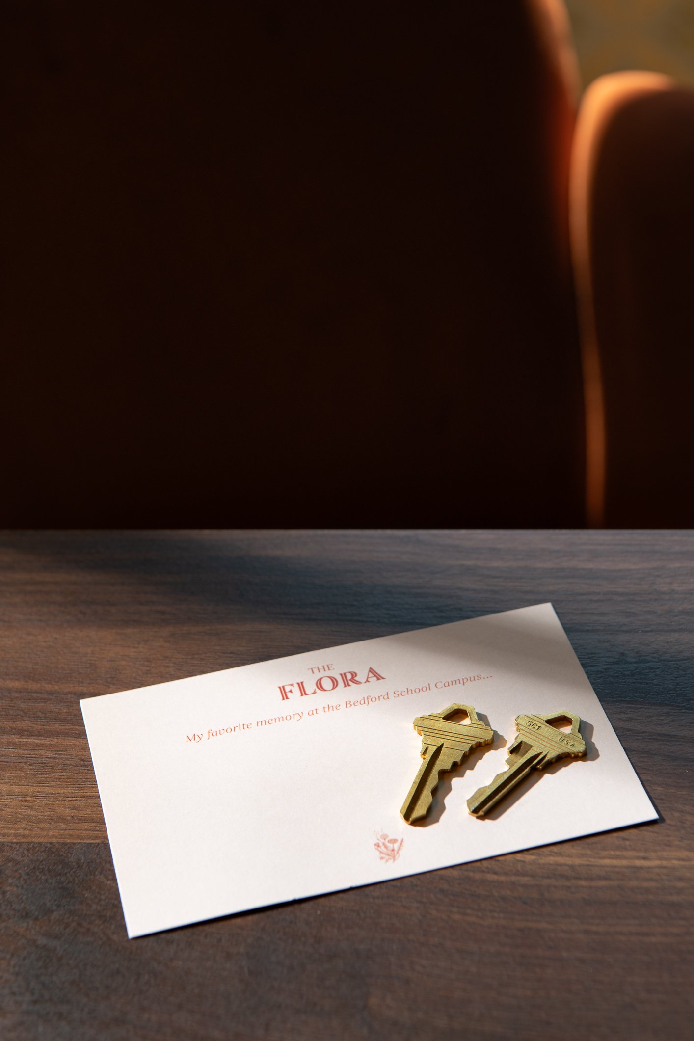
The Flora
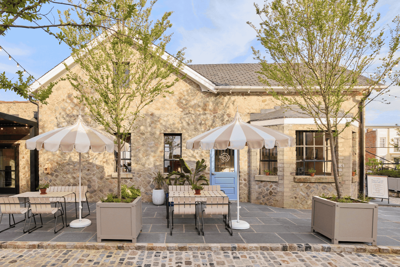
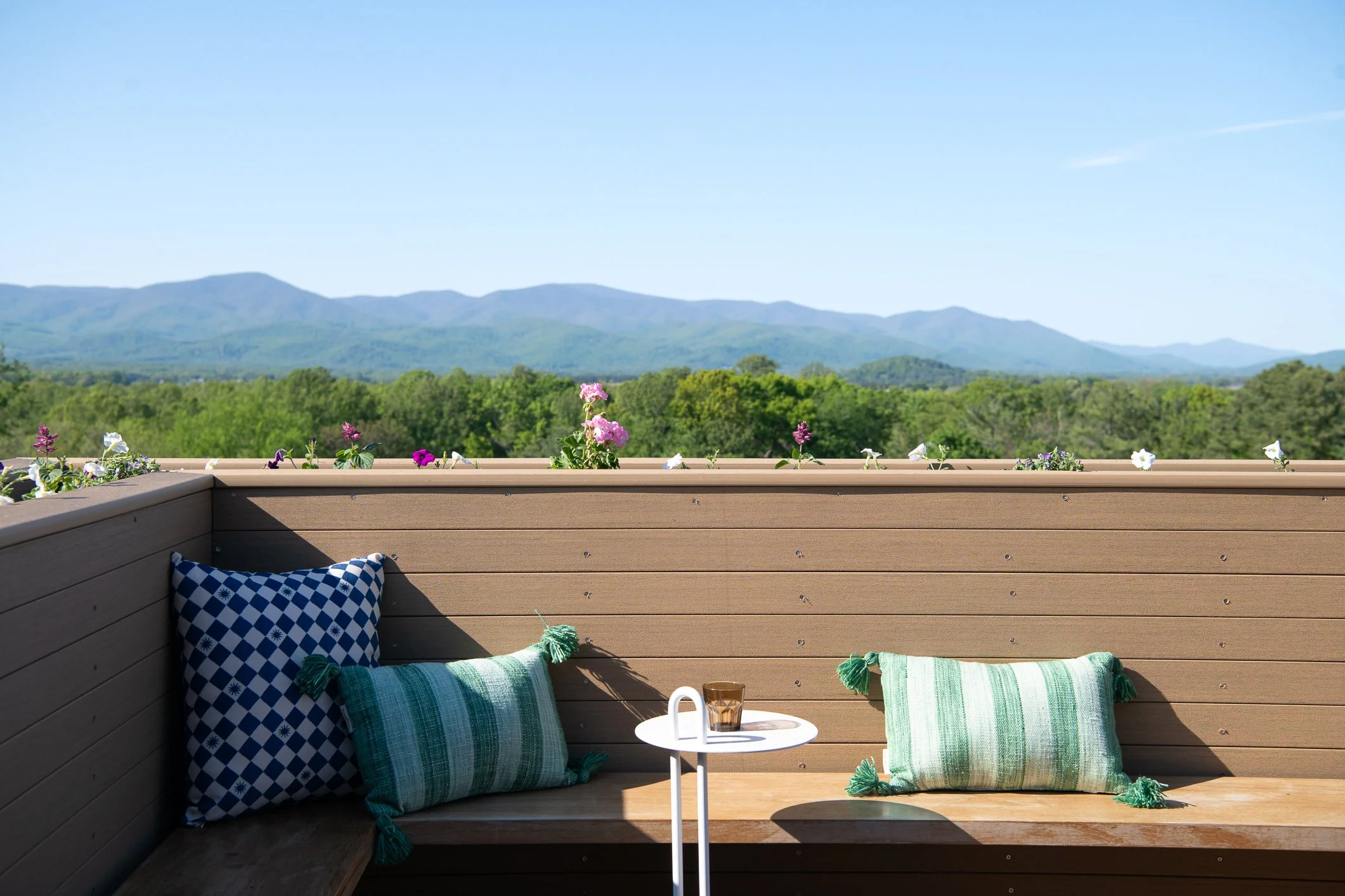
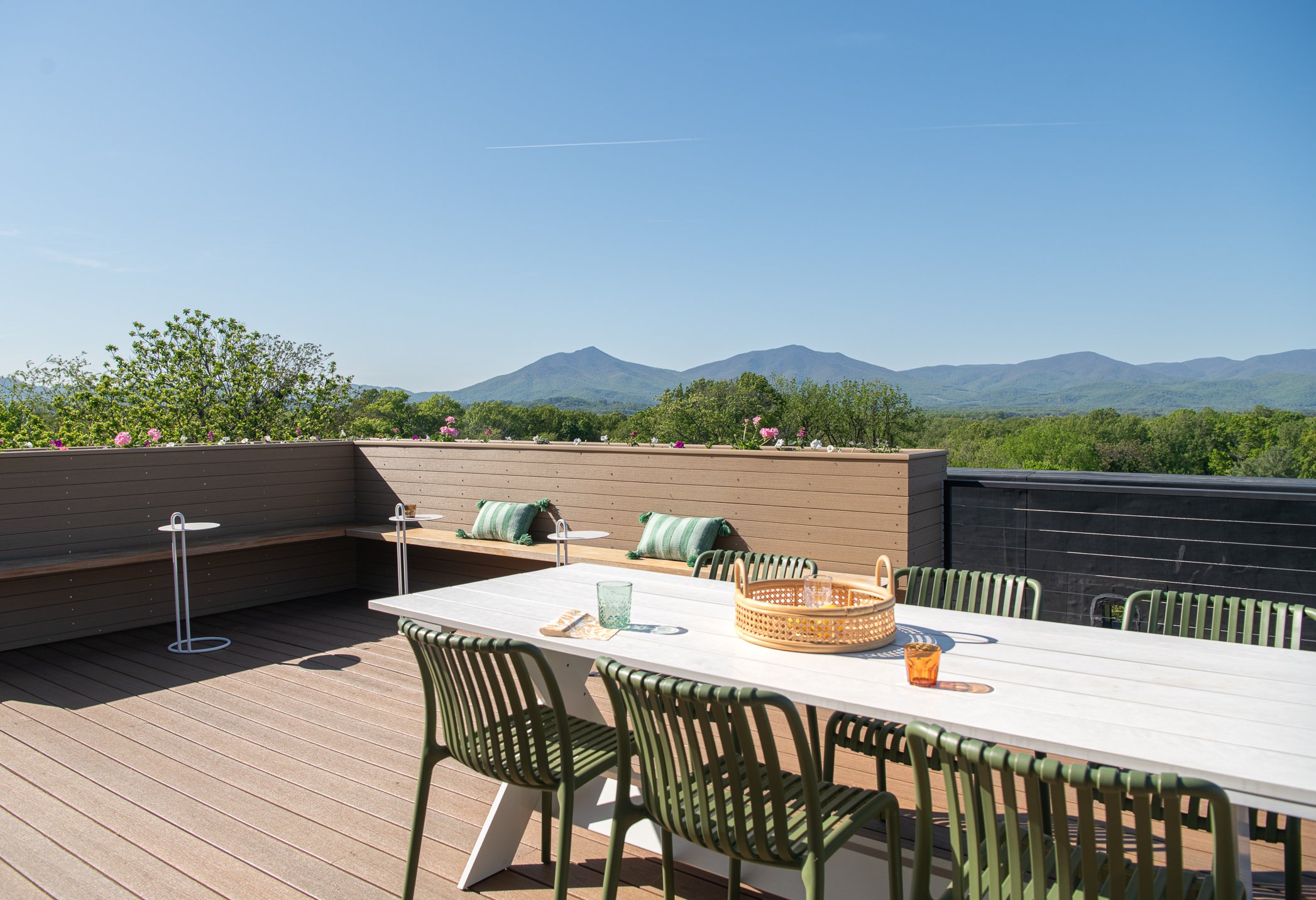
The Flora is a modern heirloom—where the rich history of a cherished school campus is beautifully reimagined for contemporary living. Featuring 59 thoughtfully designed apartments, Bedford’s first rooftop deck, tranquil courtyards, and inviting communal spaces, The Flora offers a unique blend of timeless charm and innovative design.
Where History & Nature Collide
A former middle school campus in Bedford, Virginia, one that survived a fire and decades of disuse, is now a 59-unit boutique apartment community with Bedford's first rooftop deck, two interior courtyards, and a visual identity rooted in the natural landscape surrounding it. Campfire & Co. partnered with Waukeshaw Development to shape Flora's brand from the ground up and design common area interiors that honor the building's history and natural setting.
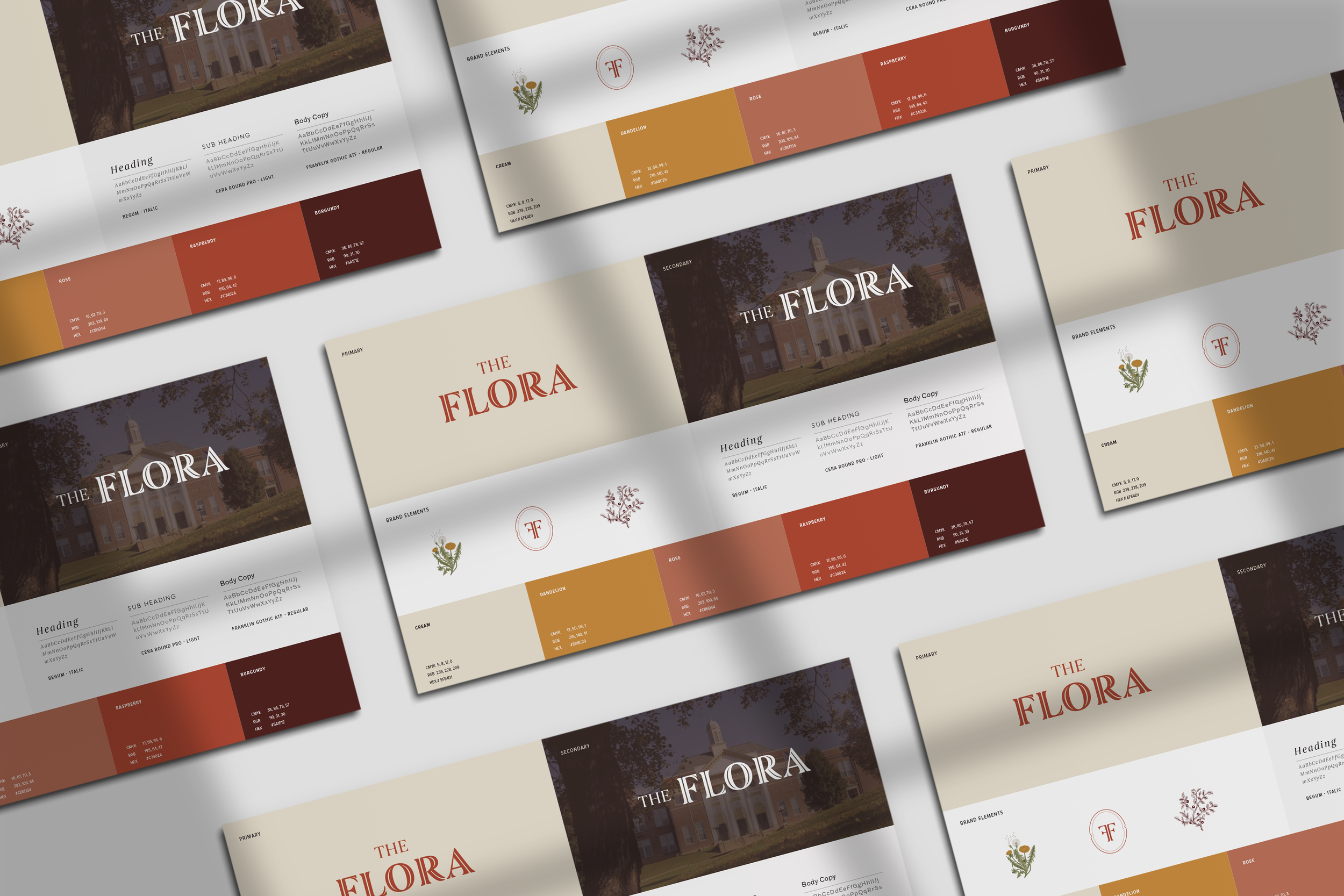
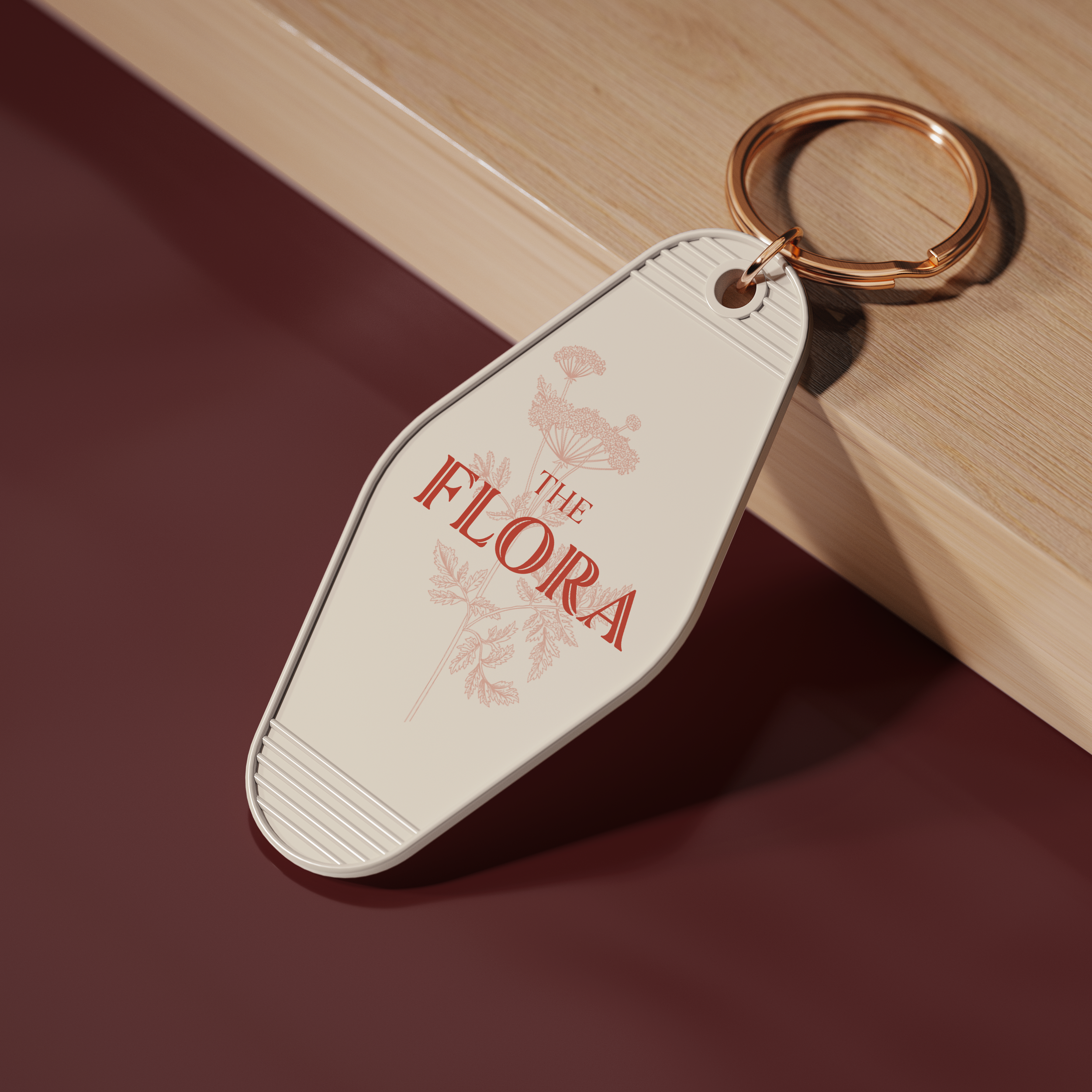
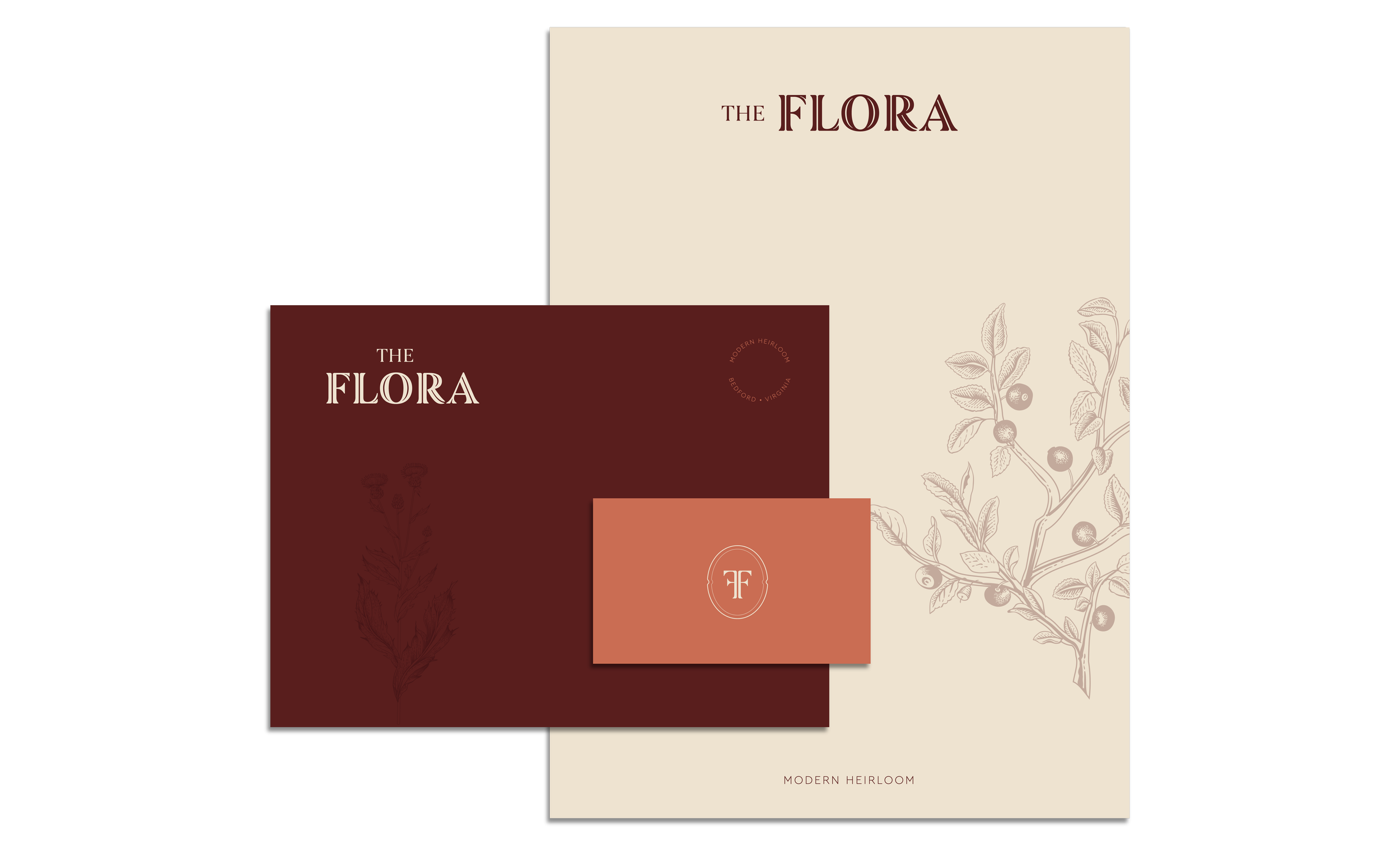
Brand Identity: Confident, Grounded, Alive
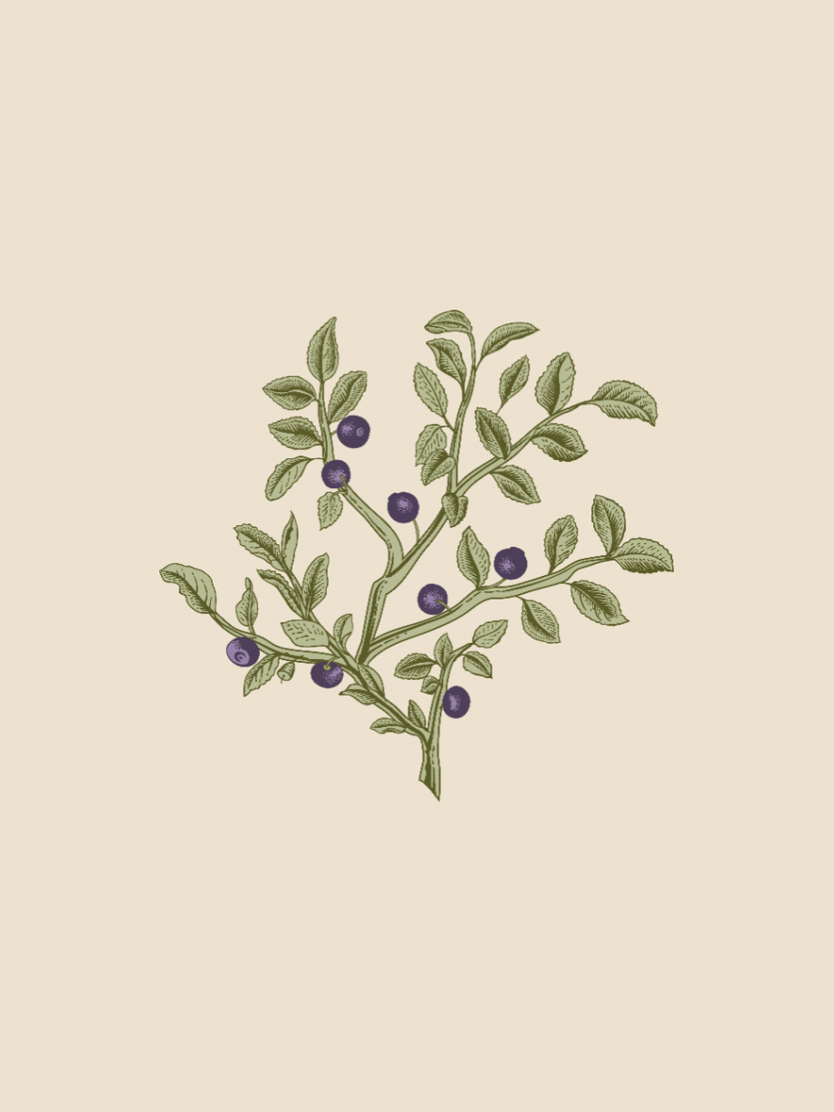
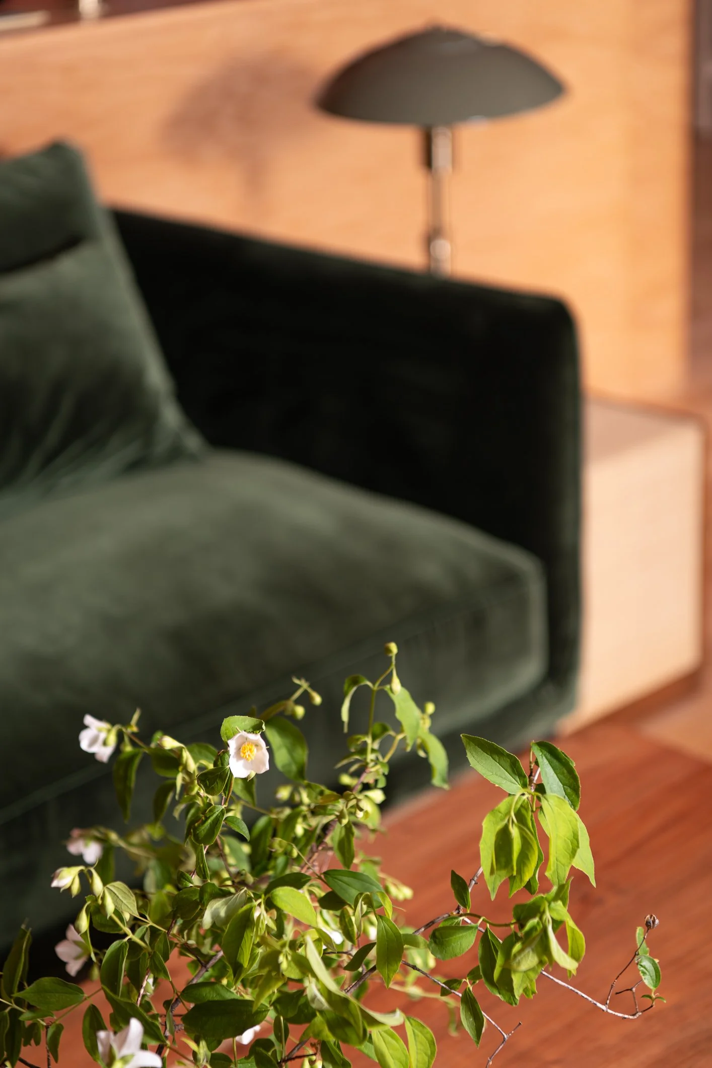
Flora's brand needed to feel timeless without reading as nostalgic, and contemporary without losing the warmth of its historic bones. We developed a visual identity anchored in native plants and botanical motifs, a nod to the Peaks of Otter landscape visible from the building's north-facing windows.
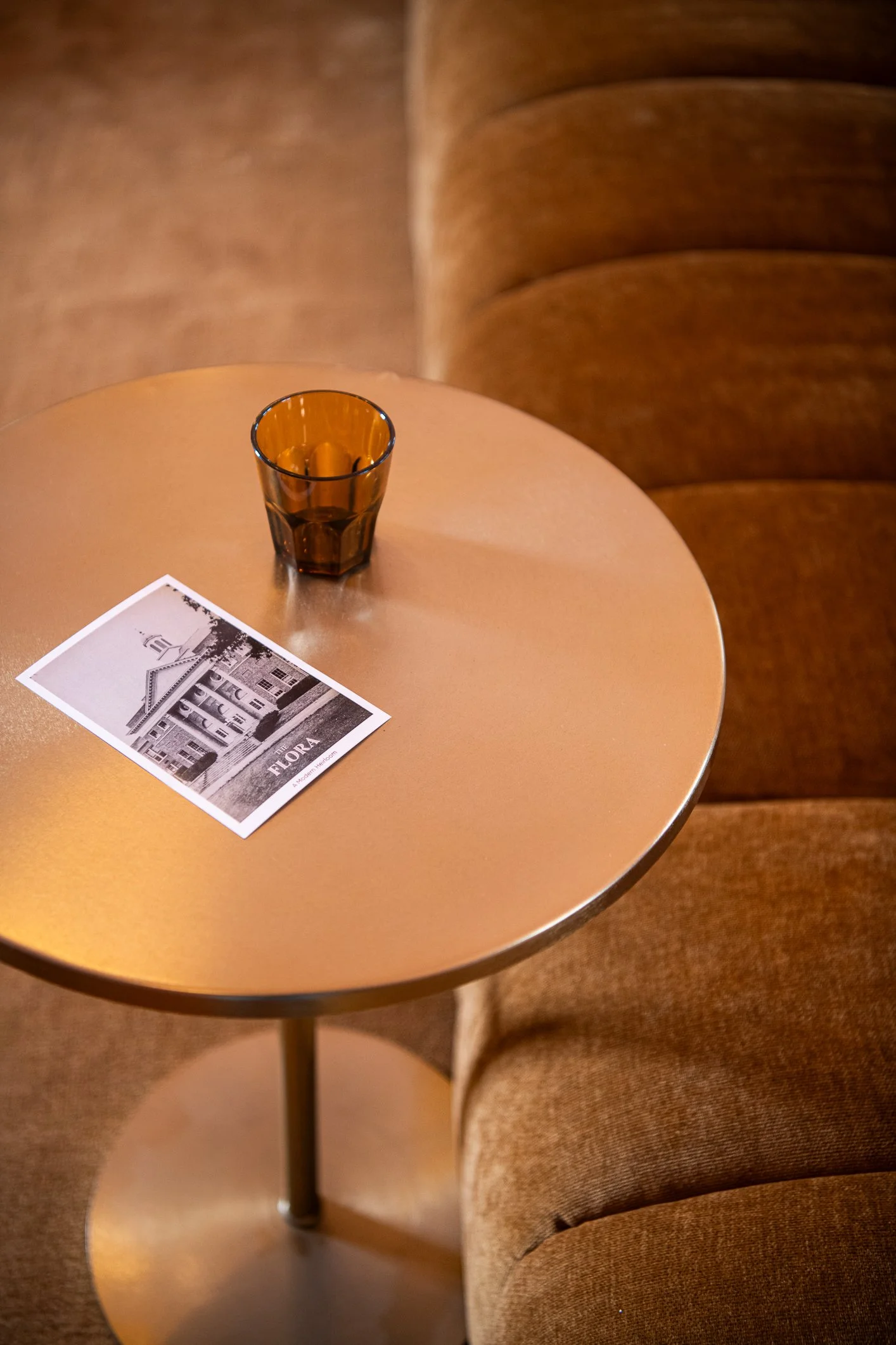
The personality we landed on is inviting and community-forward, with a voice that's casual enough to feel approachable and confident enough to signal that this is not your typical apartment experience. The palette draws from rich, warm tones that feel collected and layered rather than brand-new.

Interior Design: Three Floors, Three Worlds
A three-story former school building comes with long corridors and a risk of every hallway feeling the same. To counter that, we organized the interior design concept around a vertical narrative — three distinct zones that shift in mood and materiality as residents move through the building.
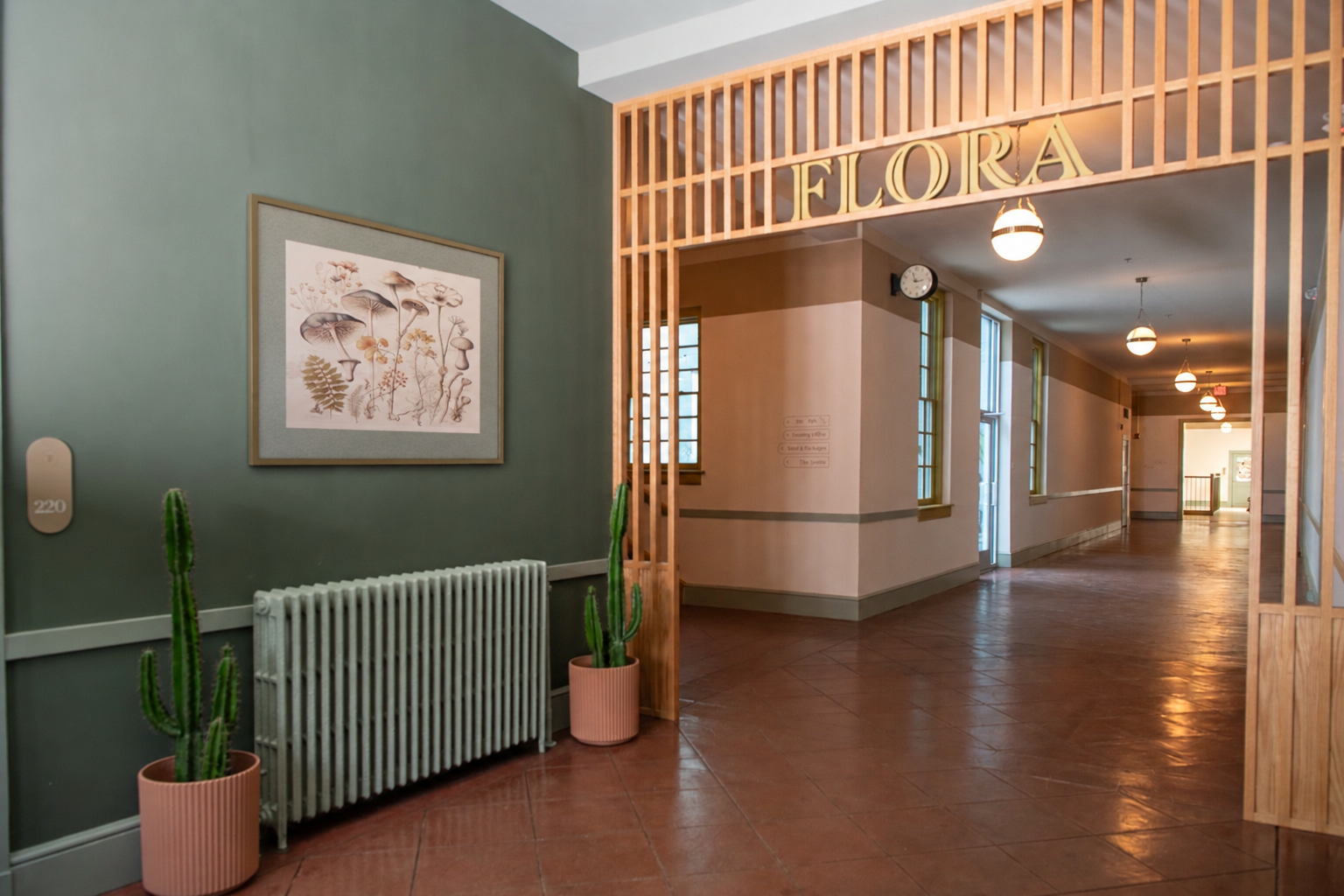
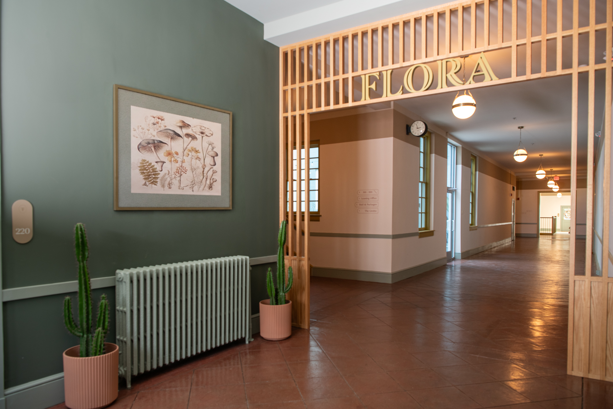
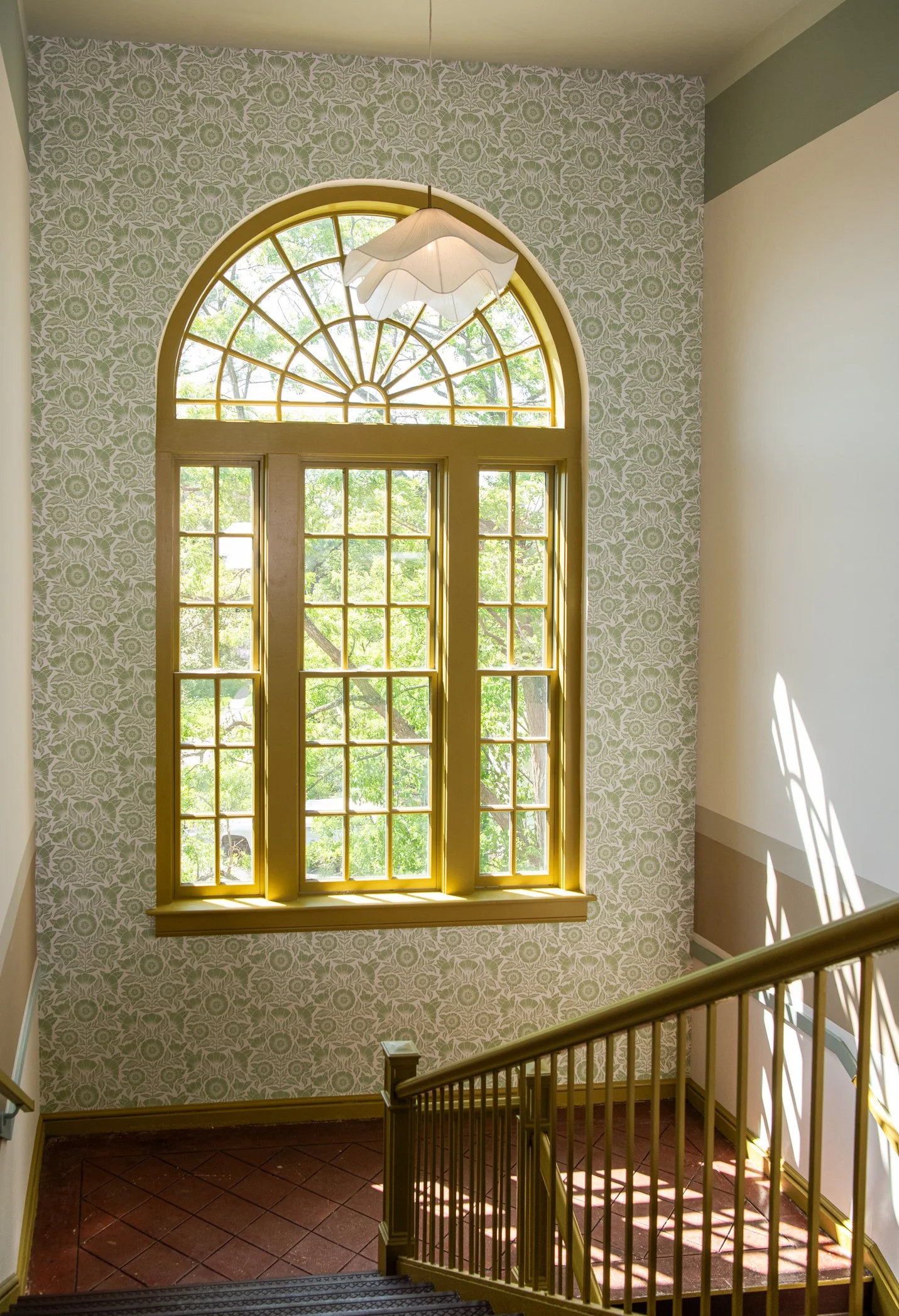
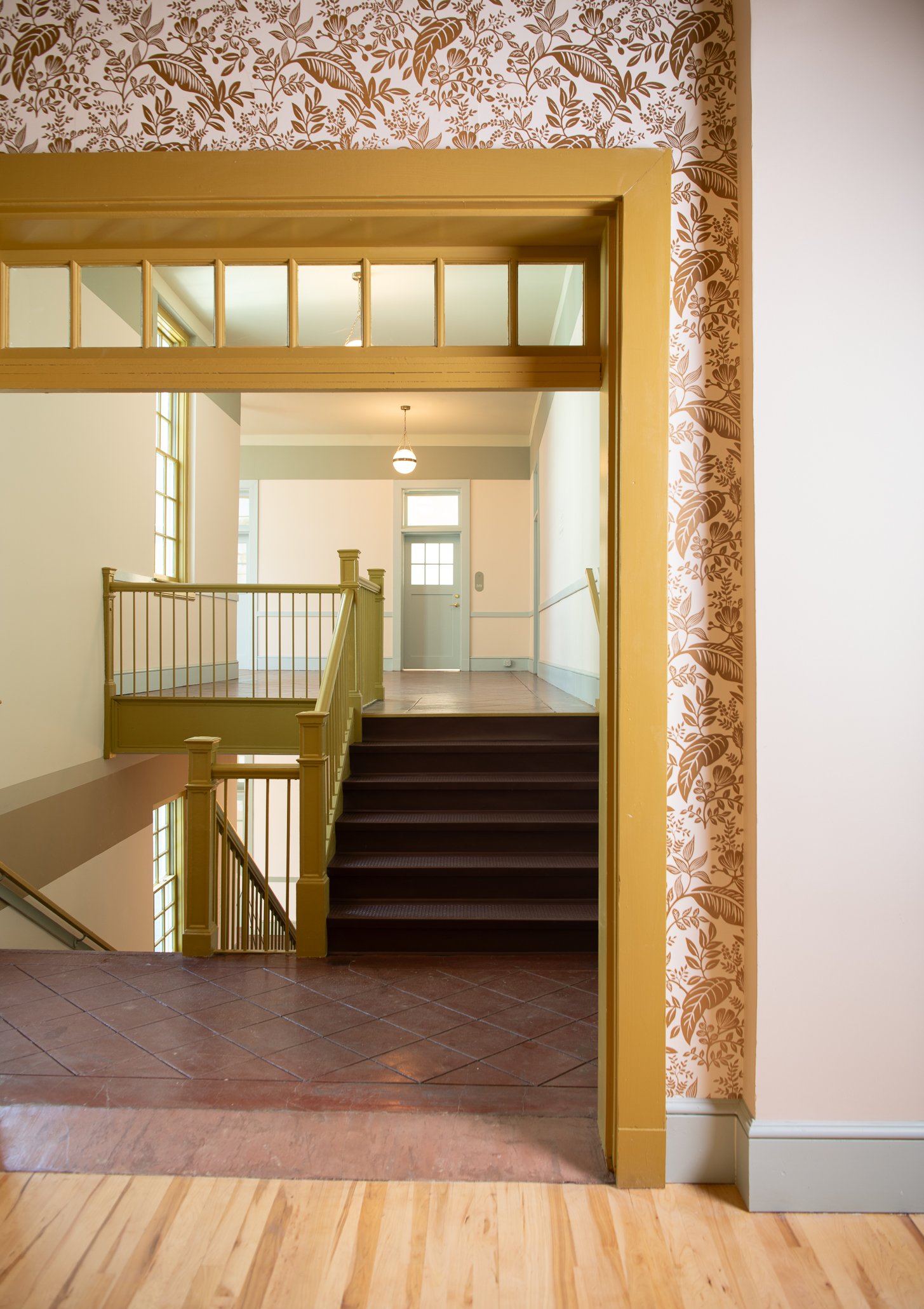
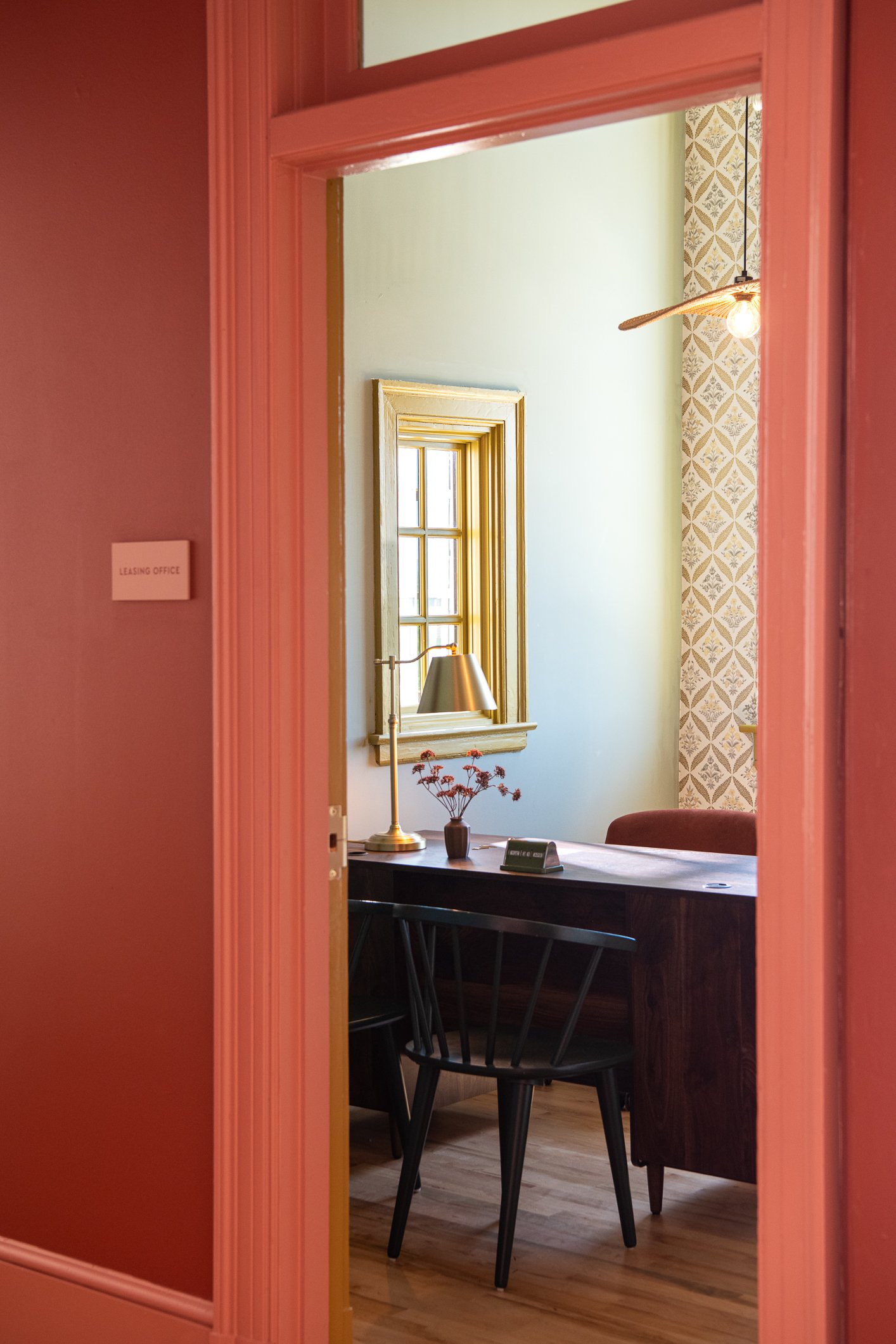
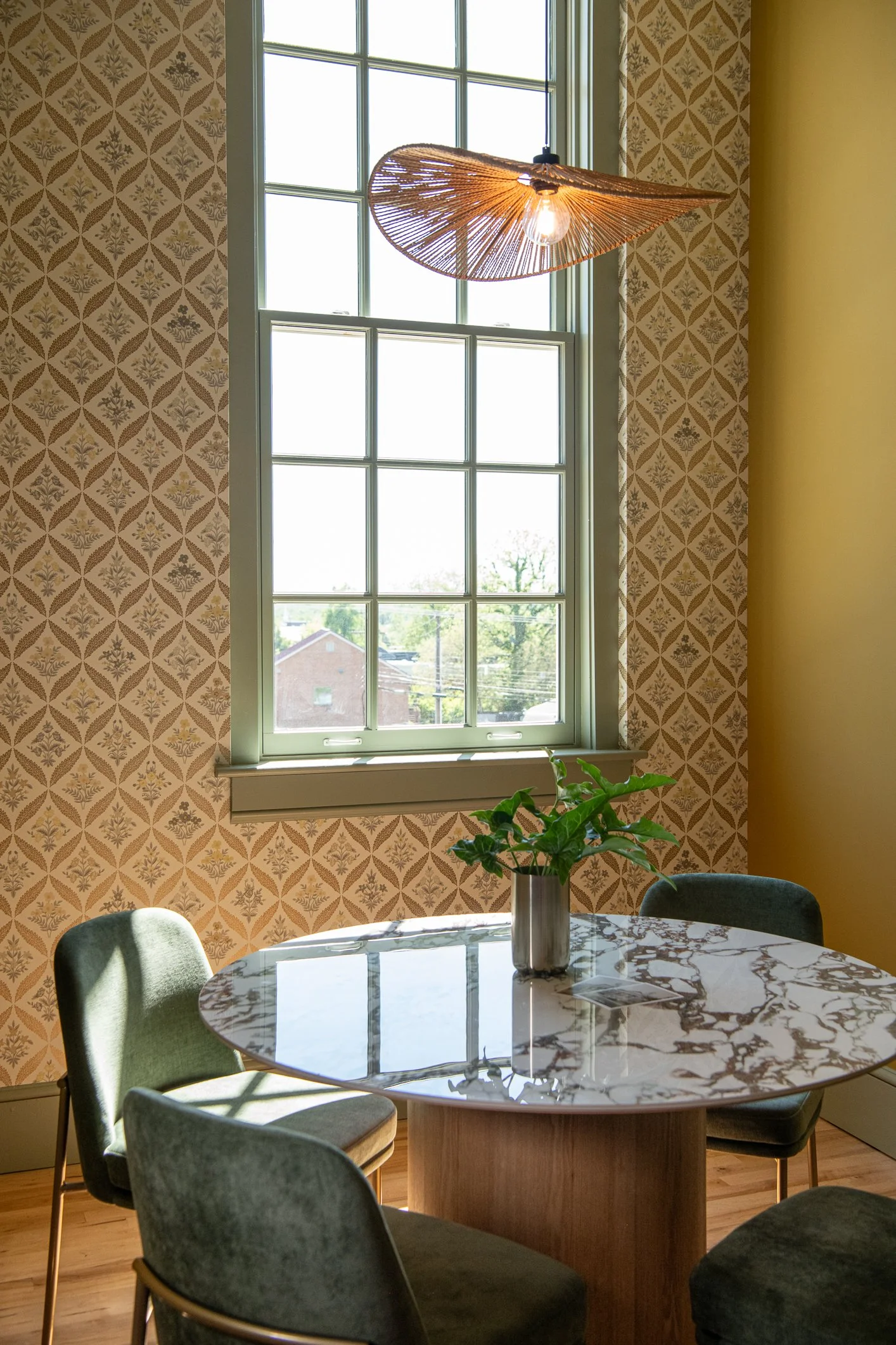
The first floor is the Forest Floor – grounded, earthy, rich. Terracotta and clay tones anchor the common spaces. The lobby leans into saturated, moody color, a jewel box effect with undulating furniture forms, mossy accent walls, and a chocolate brown area rug in the leasing office. A botanical wallpaper on the stair landing features not just leaves but insects and fruit, adding depth without defaulting to the expected.
The second floor shifts into what we called the Greenhouse — lush, layered, and a touch more refined. Classic motifs play off the building's existing niche arches. Terracotta tones carry through but start to lighten, and mirrored and reflective objects introduce a new dimension. The color throughline ensures the floors feel connected, not disjointed.
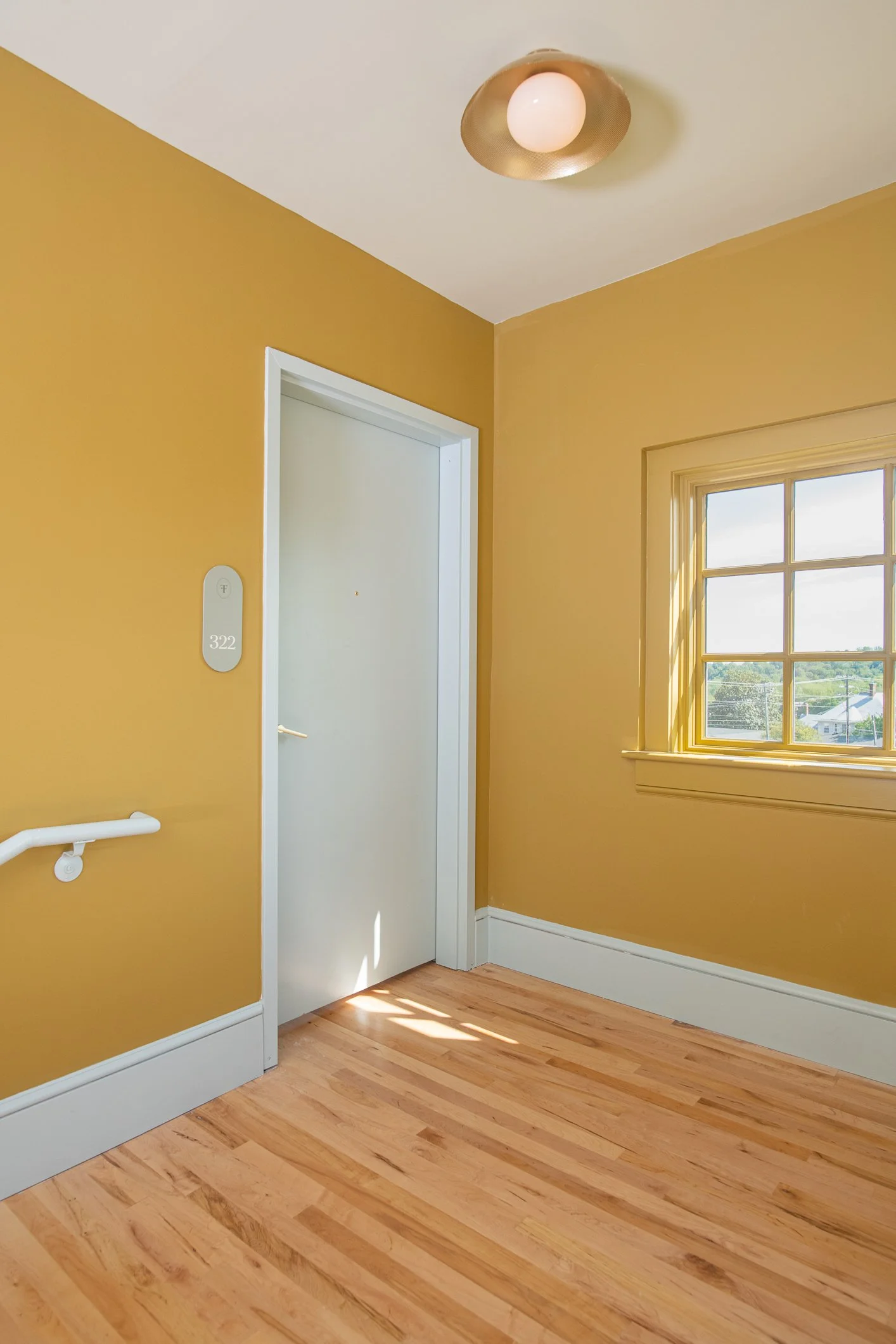
By the third floor, the Canopy — the palette opens up entirely. Sky blues, soft yellows, warmth borrowed from sunshine. The design is deliberately minimal here, creating visual momentum that draws residents upward toward the rooftop deck.
Wayfinding Through Color
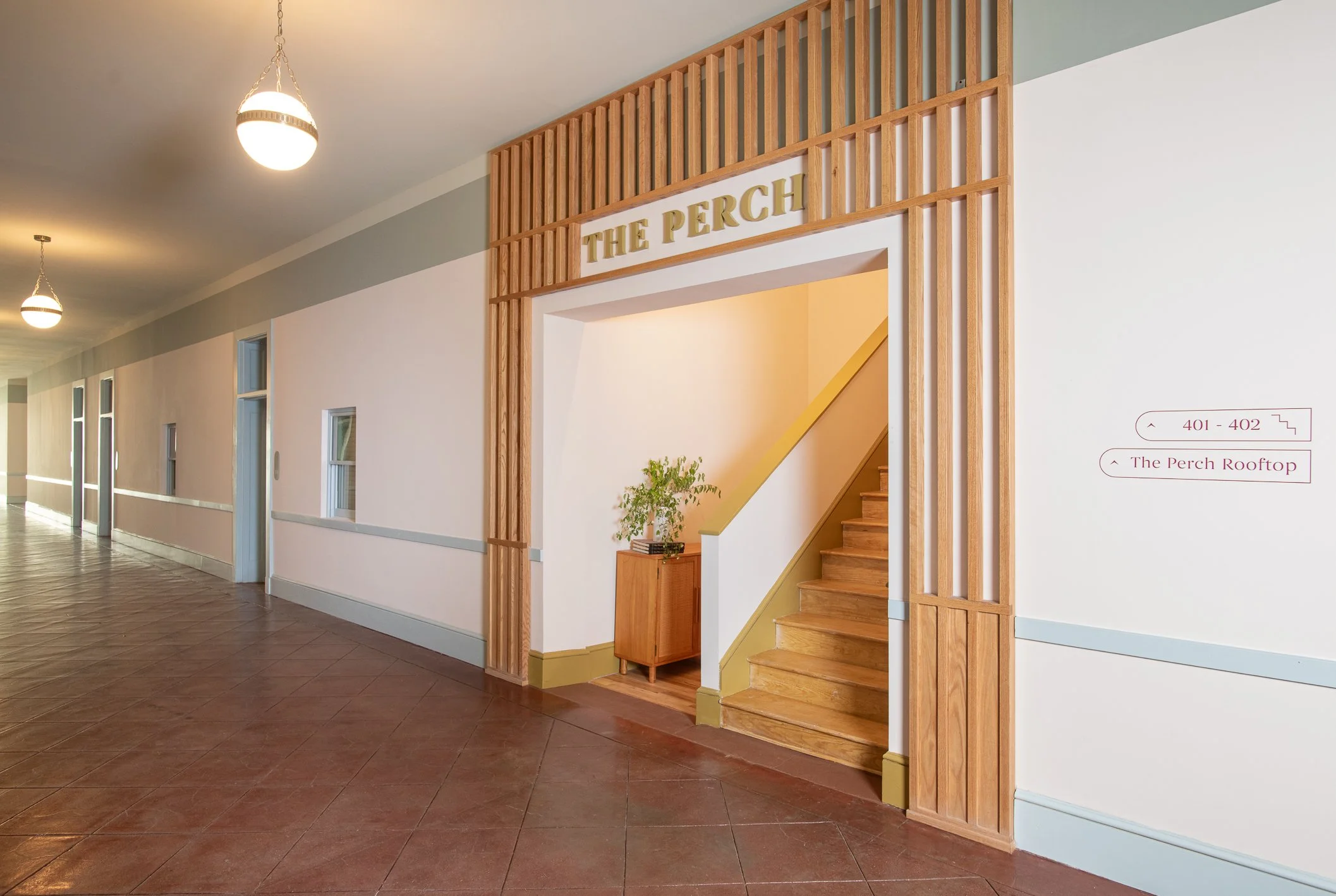
In a building this size, getting oriented matters. We used paint strategically — not just as finish, but as navigation. A two-tone wall treatment turns down at the door frame line, accentuating the corridor's height while breaking the visual monotony of long hallways. An accent color frames key portals in paint — courtyard entrances, transitions between the original building and the rear addition, the passage up to the roof deck — essentially telling people where to go without a sign.
Vintage-inspired globe lights with three-chain pendants reinforce the building's character while providing a warm, even rhythm down the corridors. The effect is a space that feels curated and intentional rather than institutional — the opposite of tired "school as apartments."
Transition Portal: First Impressions Count
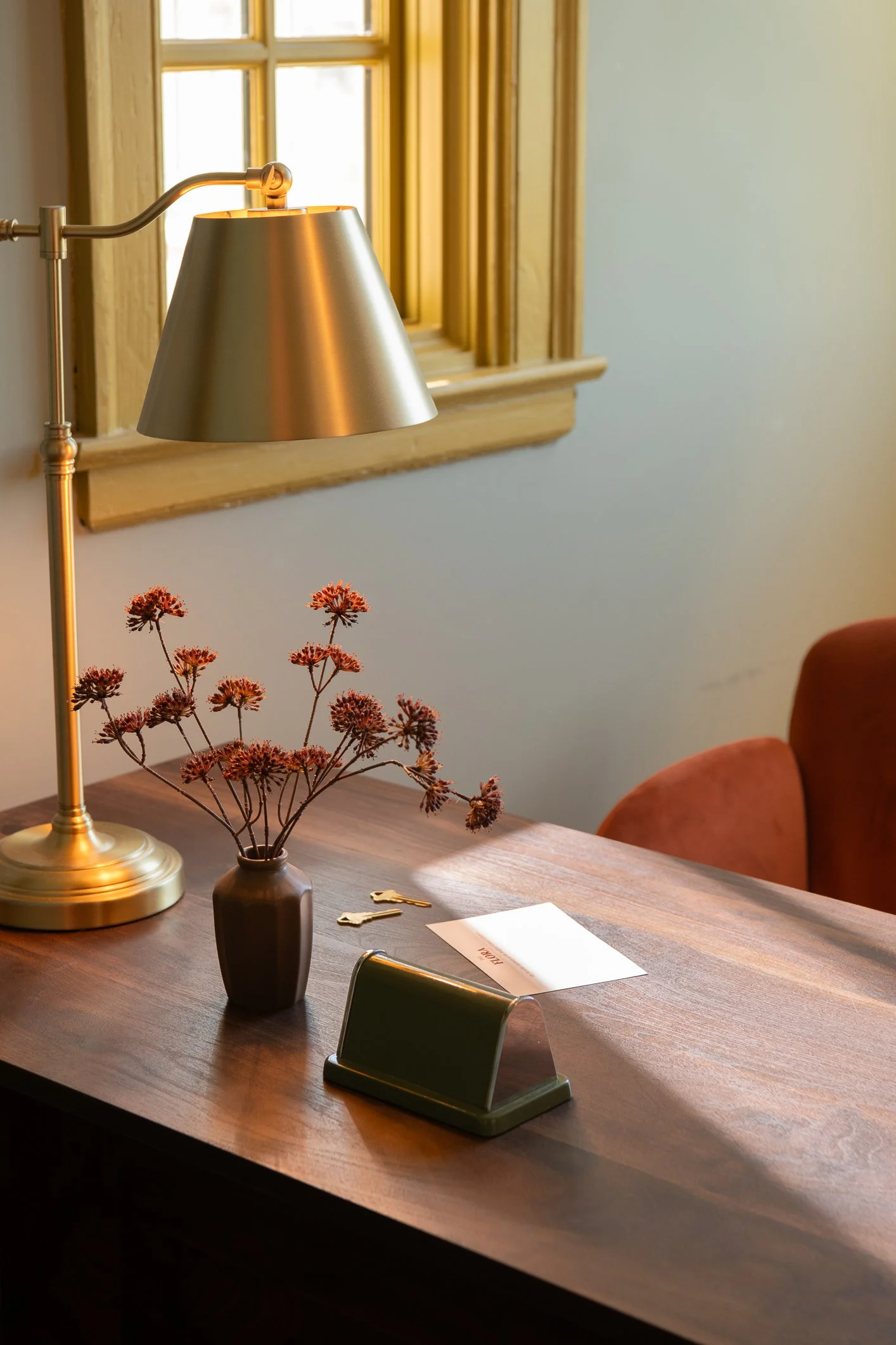
The main entry needed to do a lot of work fast — establish the brand, break the long hallway, and set the tone before a resident or visitor takes ten steps. We designed a transition portal inspired by garden trellises and birdcages, a sculptural frame that signals arrival. Behind it, a saturated paint color grounds the vestibule, a statement light fixture throws dramatic shadows upward, and a restrained handful of art and planters complete the moment. Simple tools, high impact.
Courtyards: Two Sides of the Same Story
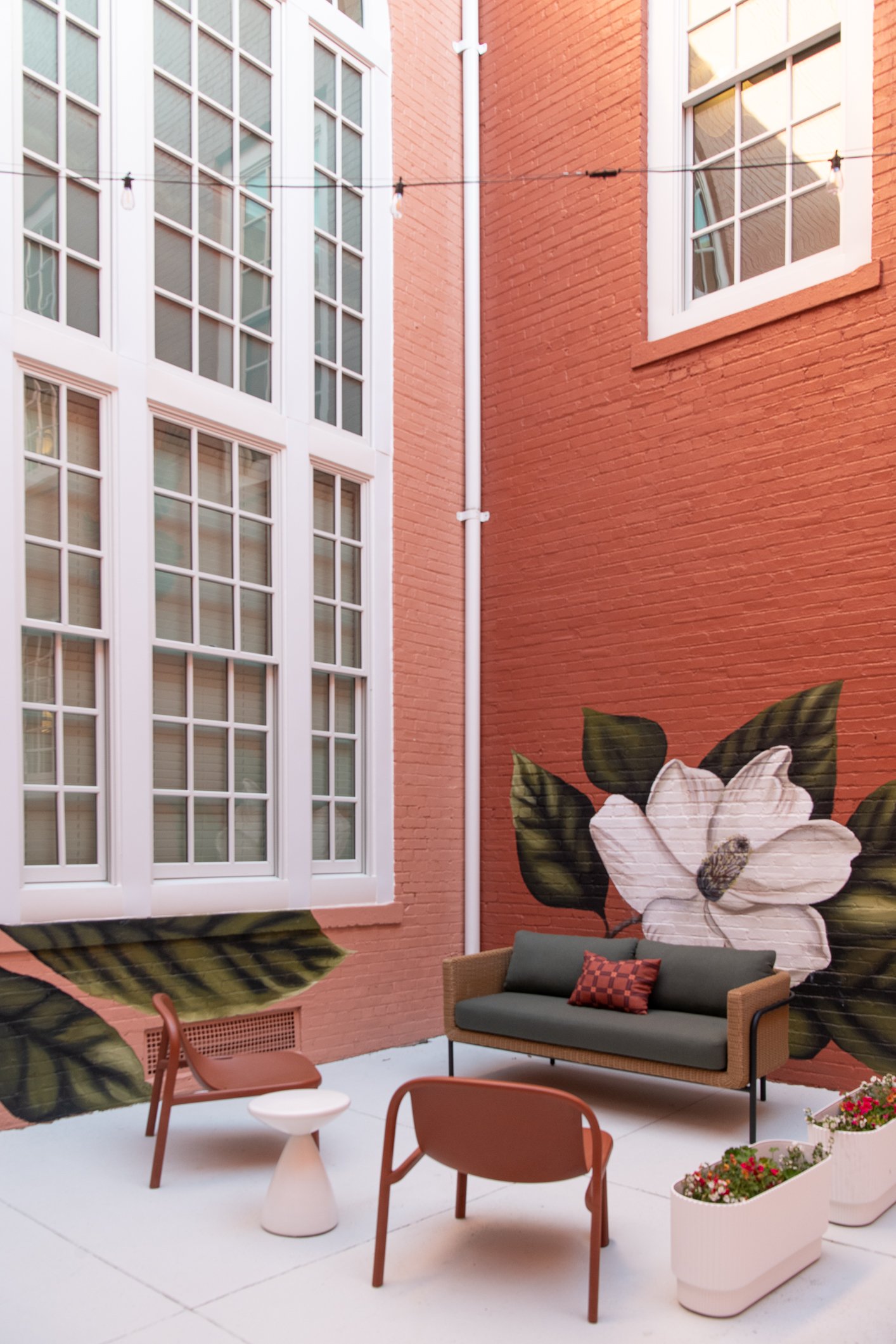
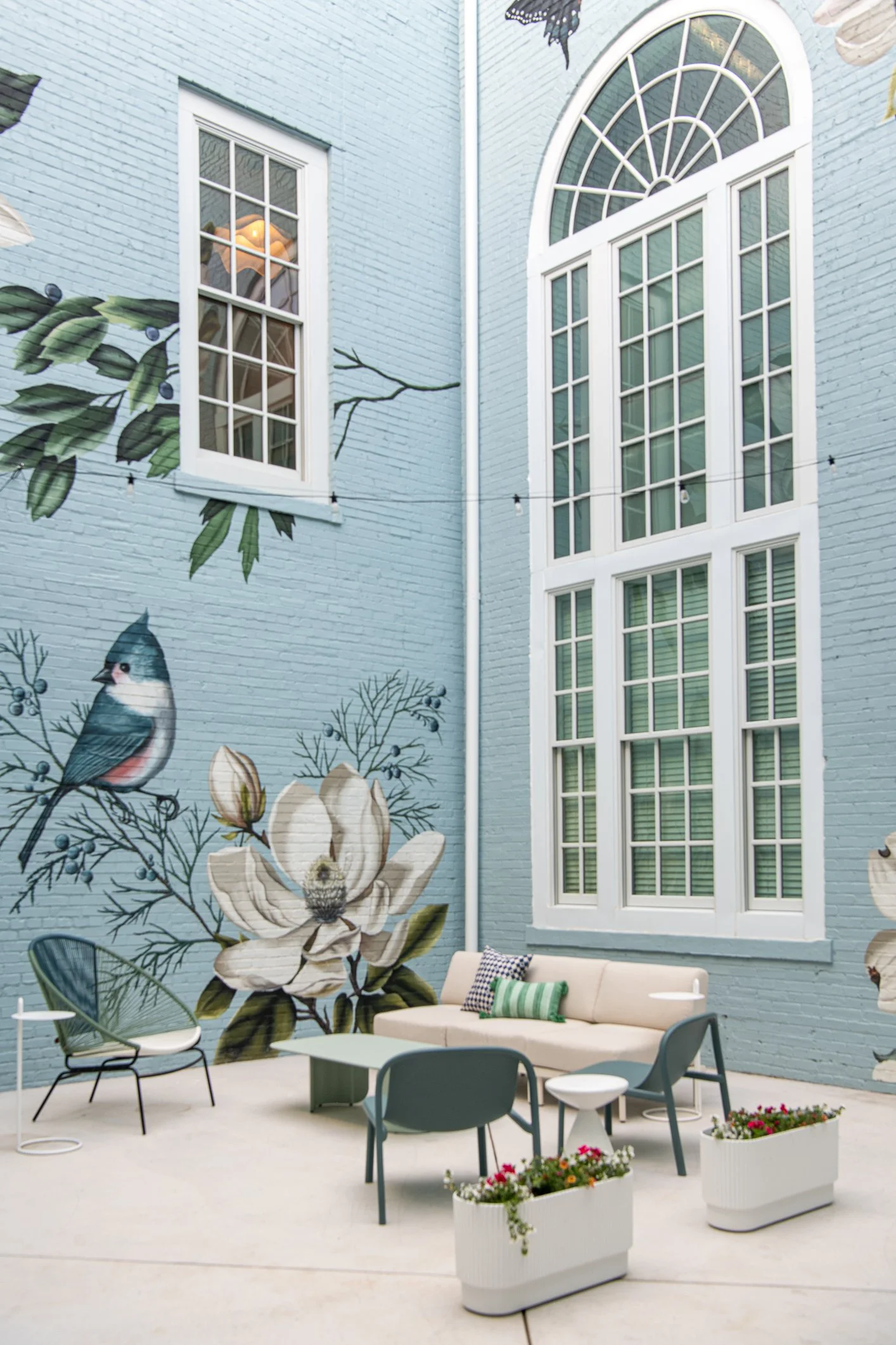
The two interior courtyards were the spaces the client was most excited about, and for good reason — they're rare in Bedford and entirely unique to Flora.
The west courtyard runs warm: dusty terracotta, two-tone painted brick, organic freeform murals placed as vignettes rather than covering full walls. A canopy of string lights scales down the space and makes it feel intimate. Tiled planters and an all-weather area rug bring in color and texture that hold up to the elements.
The east courtyard tilts cooler and more active — a palette of blues and soft sage greens, pops of sunny yellow on the high-top tables, and a ping pong table that invites use. Both courtyards get the mural treatment, with botanical styles that will continue to develop as the property matures.
Spaces That Work Harder
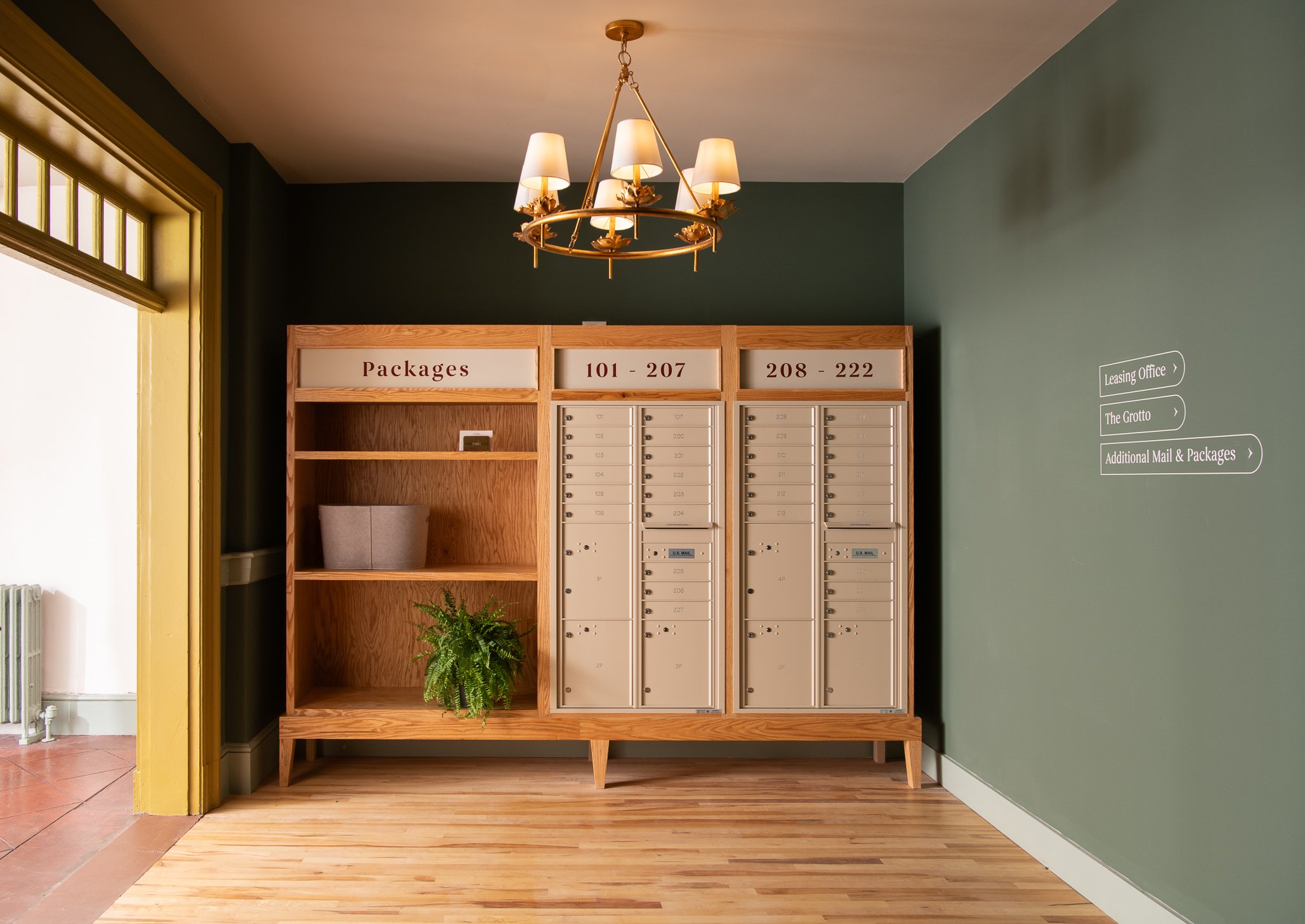
Beyond the main corridors and courtyards, we designed a handful of common spaces to serve residents' daily lives. A day office — repurposed from a package room — offers a secondary workspace with an inverted color scheme and curvy furniture forms that relate back to the lobby. The mail room got a custom casework enclosure that makes mailboxes feel designed rather than aftermarket, with a companion package storage unit scaled taller and deeper.
A Building That Grows
Flora's design moves residents through a story — from the rooted, earthy ground floor to the open, light-filled canopy above. It's an approach that turns a practical challenge (a big building with repetitive corridors) into something special residents experience and remember.
Paired with a visual identity that ties into the broader campus narrative and Bedford's natural surroundings, Flora delivers on its promise of something genuinely new for the area: an apartment community with a point of view.
CONTINUE EXPLORING
↓