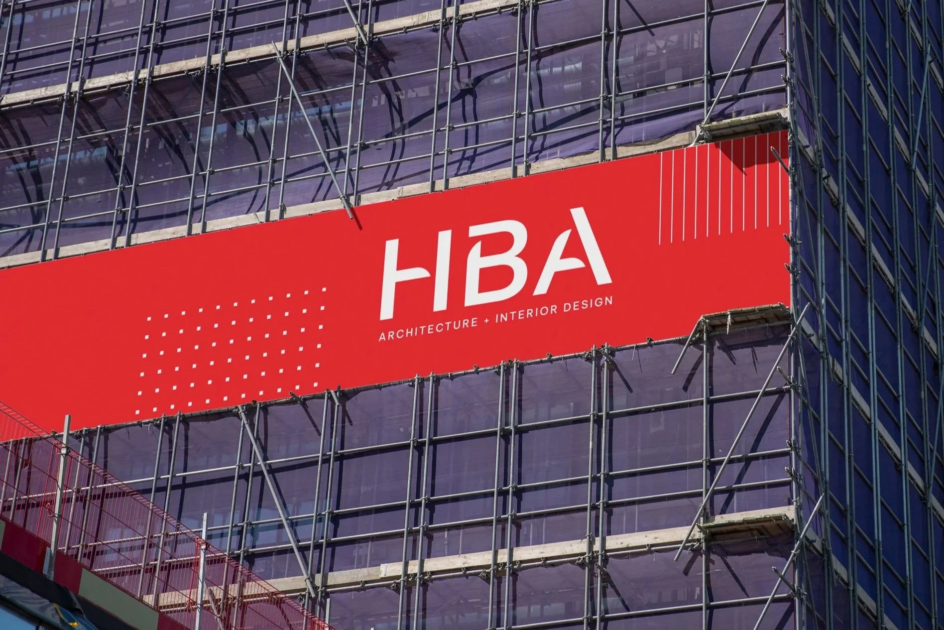
Shineforth

SERVICES
Brand Strategy
Brand Identity Design
Collateral Design
INDUSTRY
Non-Profit
Partners
Shineforth
Shineforth, previously UMFS, believes everyone has a light inside that’s deserves to be seen and nurtured. For more than 125 years, the unwavering champions for children and families at Shineforth have provided programs, services, and access to empower and equip children to face challenges and embrace healing. From foster care to education to residential treatment, Shineforth’s compassionate care leads with one simple philosophy: child-first, always.
Marking a milestone anniversary, Shineforth embraced an opportunity to honor its legacy while positioning for continued growth.
A thoughtful brand strategy process revealed that adopting a new name would help the organization connect more deeply with existing audiences and expand their reach. To complement this evolution, a new visual identity was designed to celebrate Shineforth’s legacy alongside a modern expression of clarity, confidence, and warmth. Partnering with Brand Federation on brand strategy and naming, and Campfire & Co. on creative, Shineforth’s new brand is ready to amplify its mission and energize its presence for decades to come.
Listening First
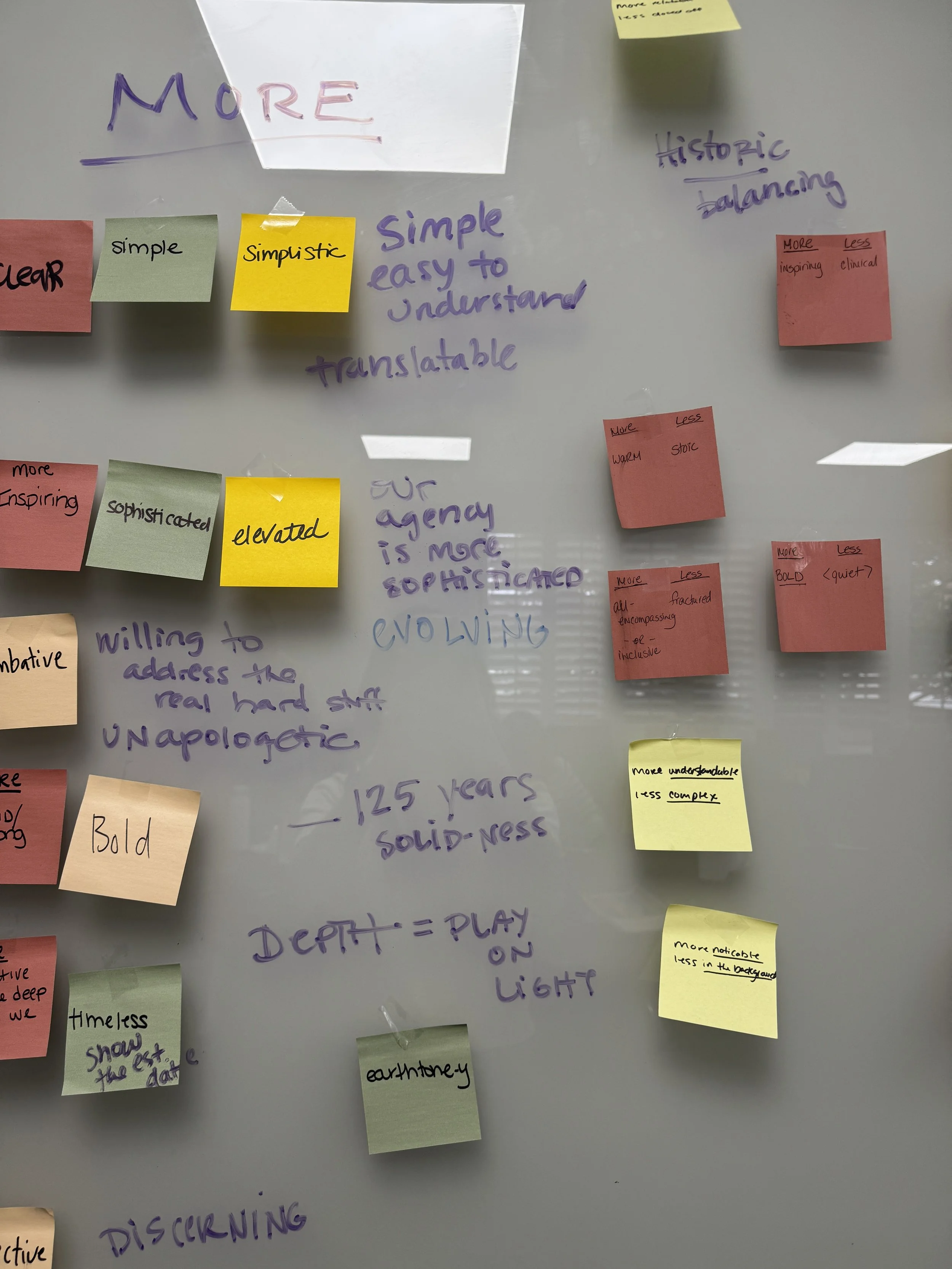
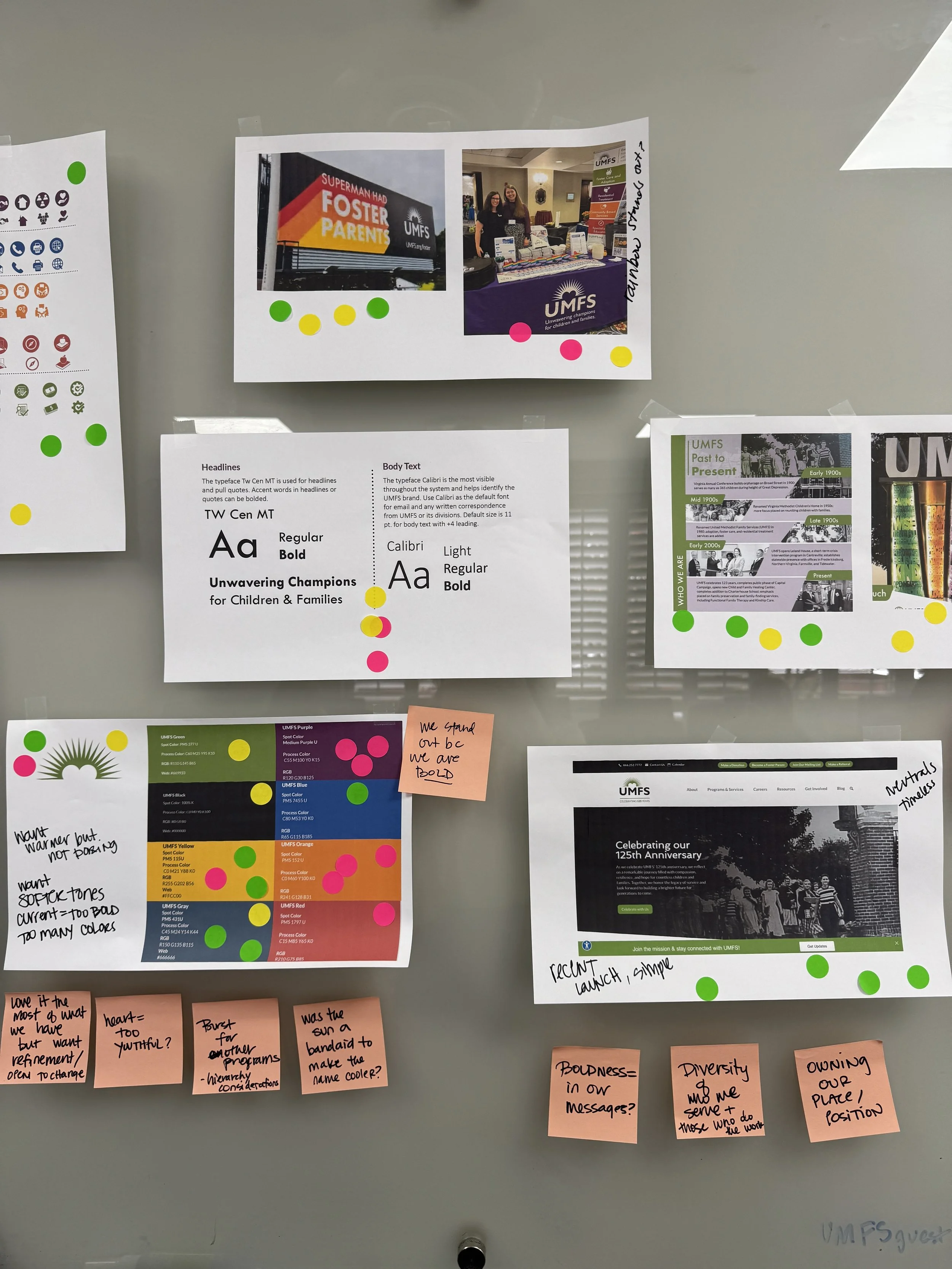
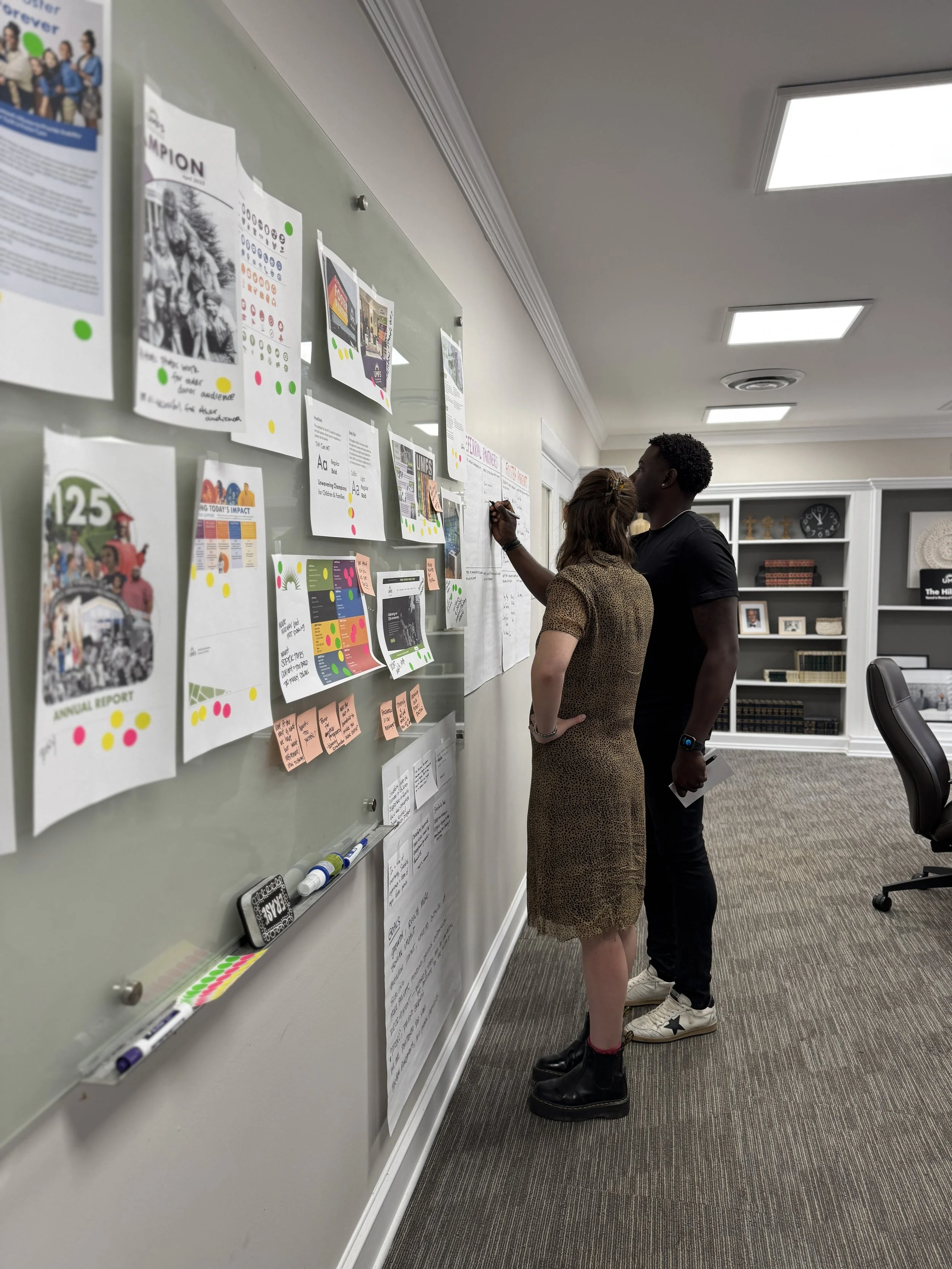
Before diving into design, the project began with a deep exploration of Shineforth’s brand strategy, led by the team at Brand Federation. This work set the stage by clarifying how the organization could best honor its 125-year legacy while positioning itself for the future. It emphasized the organization’s superpower, addressing trauma through connection, while underscoring the need to broaden awareness beyond faith-based circles, clarify its purpose for new audiences, and build a platform for long-term growth. These insights became the foundation for Campfire & Co’s creative work.
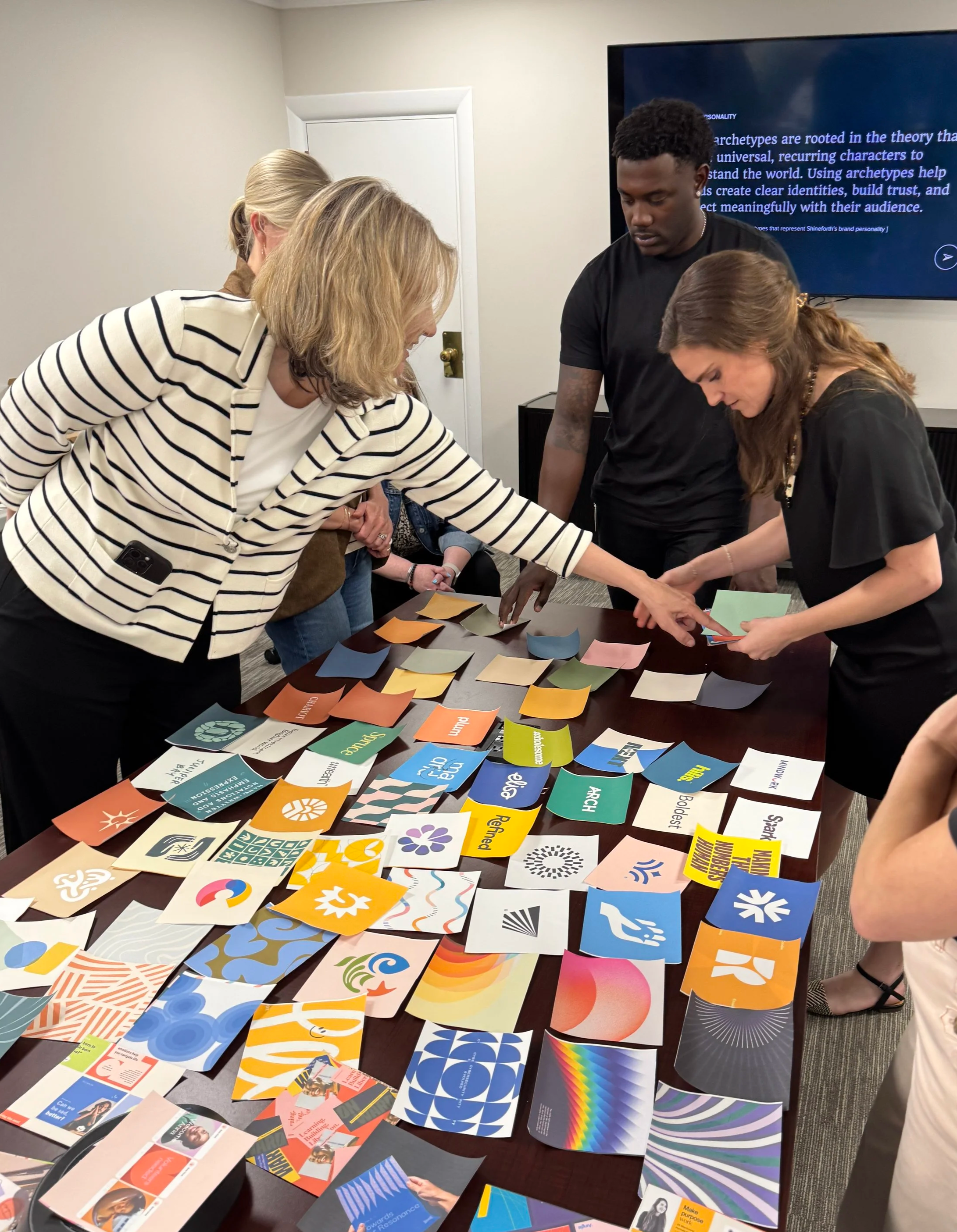
We began the identity design process with a discovery session to identify what felt true to Shineforth’s identity, and what no longer served it. Human-centered photography and motifs of growth and connection resonated deeply, while visuals that felt too corporate or juvenile missed the mark.
From these insights, a set of identity design goals emerged:
amplify and position for growth
illustrate impact through confidence
convey a bold, unwavering conviction
communicate with clarity
infuse warmth to build trust
This strategic foundation became the compass for every design decision that followed.
The Light Within
The new Shineforth identity is inspired by a simple but powerful belief: everyone carries light within them, and it needs the right environment to be seen, nurtured, and shared.
At the center of the design concept is a firefly, a small but radiant source of light that symbolizes both individual resilience and the collective beauty that emerges when communities shine together.


The firefly is more than a symbol; it is a familiar and beloved motif in Shineforth’s history, now reimagined as a beacon of empowerment and transformation.
In the icon, the firefly’s wings subtly form a heart, honoring the legacy of the organization’s previous mark, while a golden spark glows at its core, representing the light Shineforth helps every child and family uncover and amplify. A subtle star anchors the final design, a quiet reminder of the steady beacon Shineforth provides.


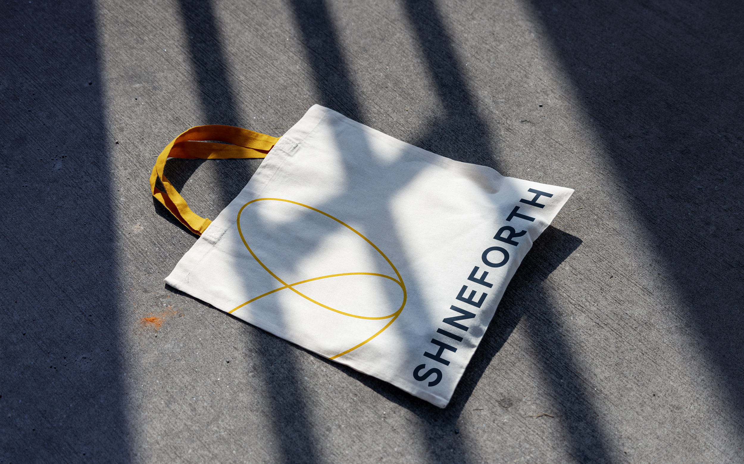
The final brand balances approachability and gravitas: an all-caps sans-serif typeface conveys longevity and impact, grounded by the friendly curve of the R, while a refined and restrained color palette adds refinement and flexibility.
Together, these elements form an identity that embodies inner beauty, shared growth, and gentle power. The brand is rooted in legacy while illuminating Shineforth’s vision for what is ahead.


A System for Designed for Growth
The full identity system extends this story across every element. A grounded palette of navy and white conveys trust and stability, paired with green and sky blue to evoke growth and care, and a vibrant yellow to embody the celebratory spark of the firefly’s light. Patterns inspired by a field of fireflies and a supergraphic heart drawn from the wings of the logo add depth and flexibility. Transitional marks that include “Formerly UMFS” help connect audiences during the brand’s rollout, bridging recognition with clarity.
Every piece of the system was designed to be cohesive and human-centered, layering messaging, photography, and graphics in a way that consistently communicates Shineforth’s purpose.


Lighting the Way Forward
More than a new look, Shineforth’s identity is a visual embodiment of its mission: to walk beside each child and family with care, love, and conviction. It honors 125 years of legacy while shining a light toward the future: a brand that reflects the hope, strength, and transformation at the heart of Shineforth’s work.