Slurp! Ramen
SERVICES
Brand Identity Design
Interior Design
INDUSTRY
Hospitality
PARTNERS
Willhouse Construction, Earth Surprise Murals
AWARDS
First Place in Hospitality, Interior Design Excellence Awards
Slurp! Ramen
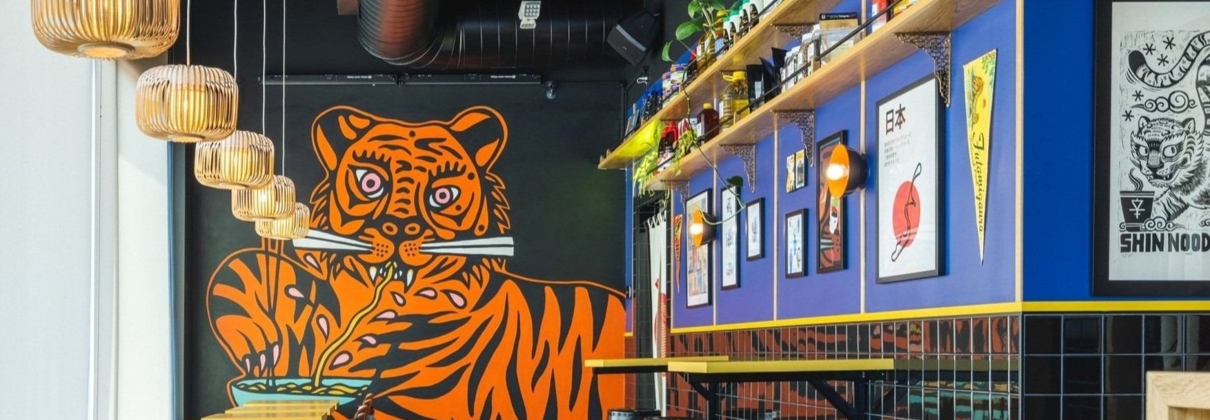
Slurp! Ramen’s brand is quirky, casual, and energetic. With the aim to embody this personality in the new brick and mortar location, this space was seen as an opportunity to showcase the energy and hustle of the brand. Slurp! features vibrant colors, bold materials, and eye-catching instagrammable moments, creating an immersive design experience that’s rarely prioritized in fast-casual dining.
Slurp! is one half of a dual-use space, which presented unique design challenges and opportunities.
Splitting a triangular space into two sides, the design team was tasked with identifying the best location for shared functions (such as the kitchen and restrooms), but also making sure the two concepts had uniquely identifiable personalities and aesthetics.
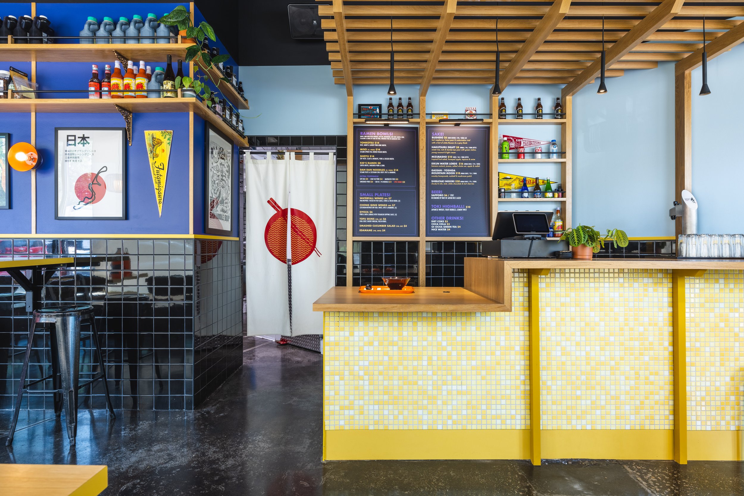
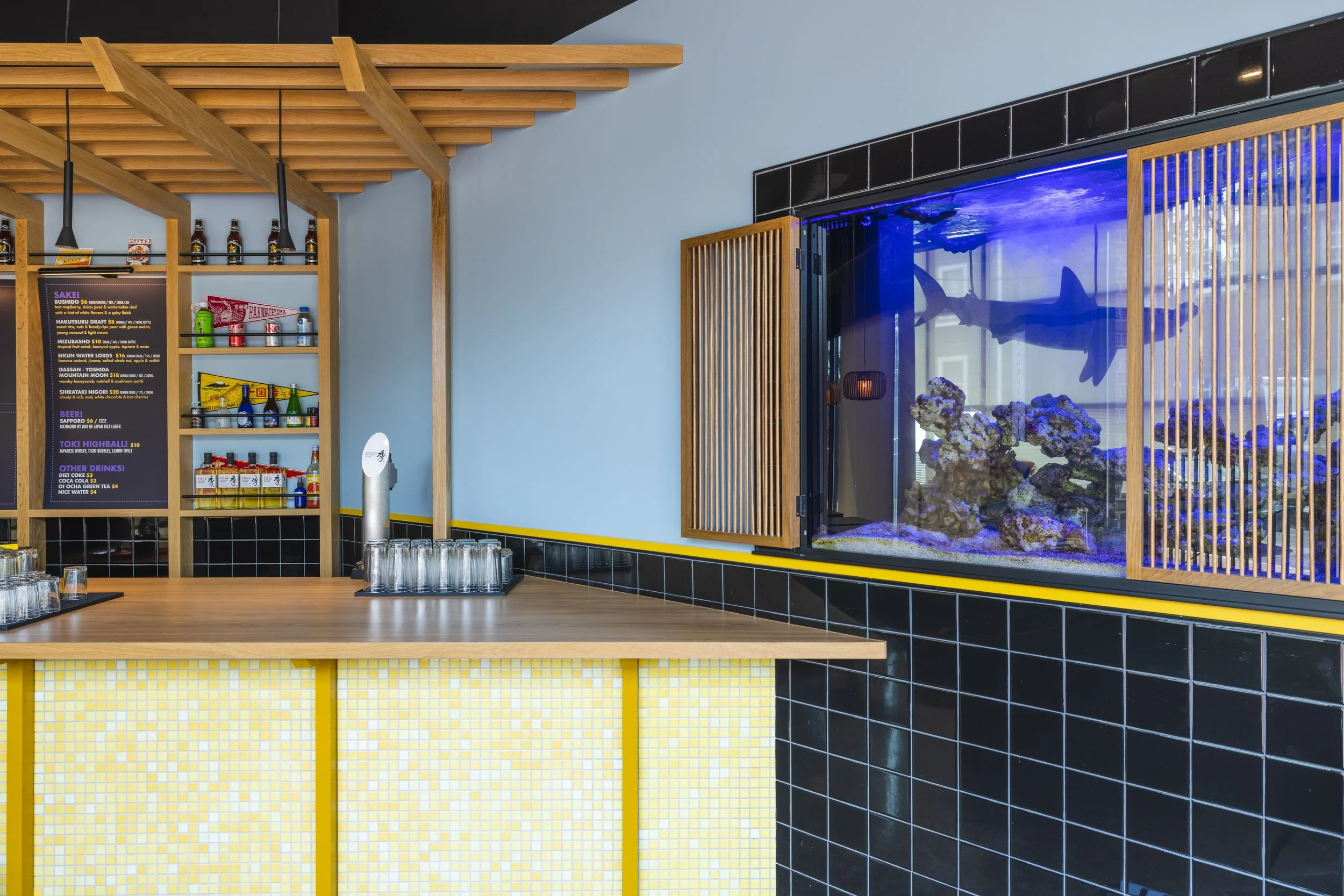
To anchor the Slurp! space, impactful visuals were used at both ends. At the entrance, guests are greeted with a Japanese-inspired pergola over the counter and coral aquarium with custom bamboo shutters built into the wall. At the other end, an eye-catching, quirky mural of a noodle-slurping tiger provides an endpoint for that half of the space as well as an excellent Instagrammable moment.
In between these points, the energetic interior includes a color palette of deep indigo, glossy black, vermillion, and vibrant yellows mixed with light woods and raw industrial elements such as polished concrete and exposed ductwork. Streamlined minimalist seating is designed for quick dining turnover and easy maneuverability in a small space.
A feature display wall creates graphic vignettes that double as storage for menu ingredients along with retro decor and live greenery. Custom-made ramen bowl sconces are hung above high-top tables and a noodle-inspired neon light hangs over the curtained hallway.

