Diamond District, Shineforth, Hodges, & The Birney All Take Home Top Branding Honors
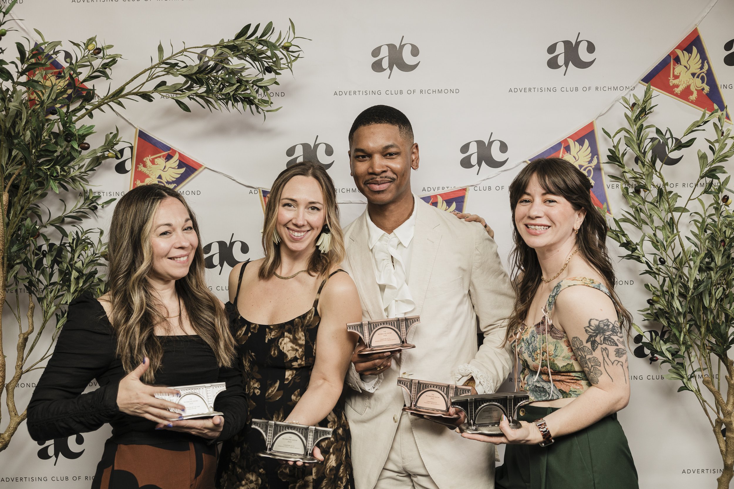
Four Campfire projects recognized for brand identity and design at this year's Richmond Show!
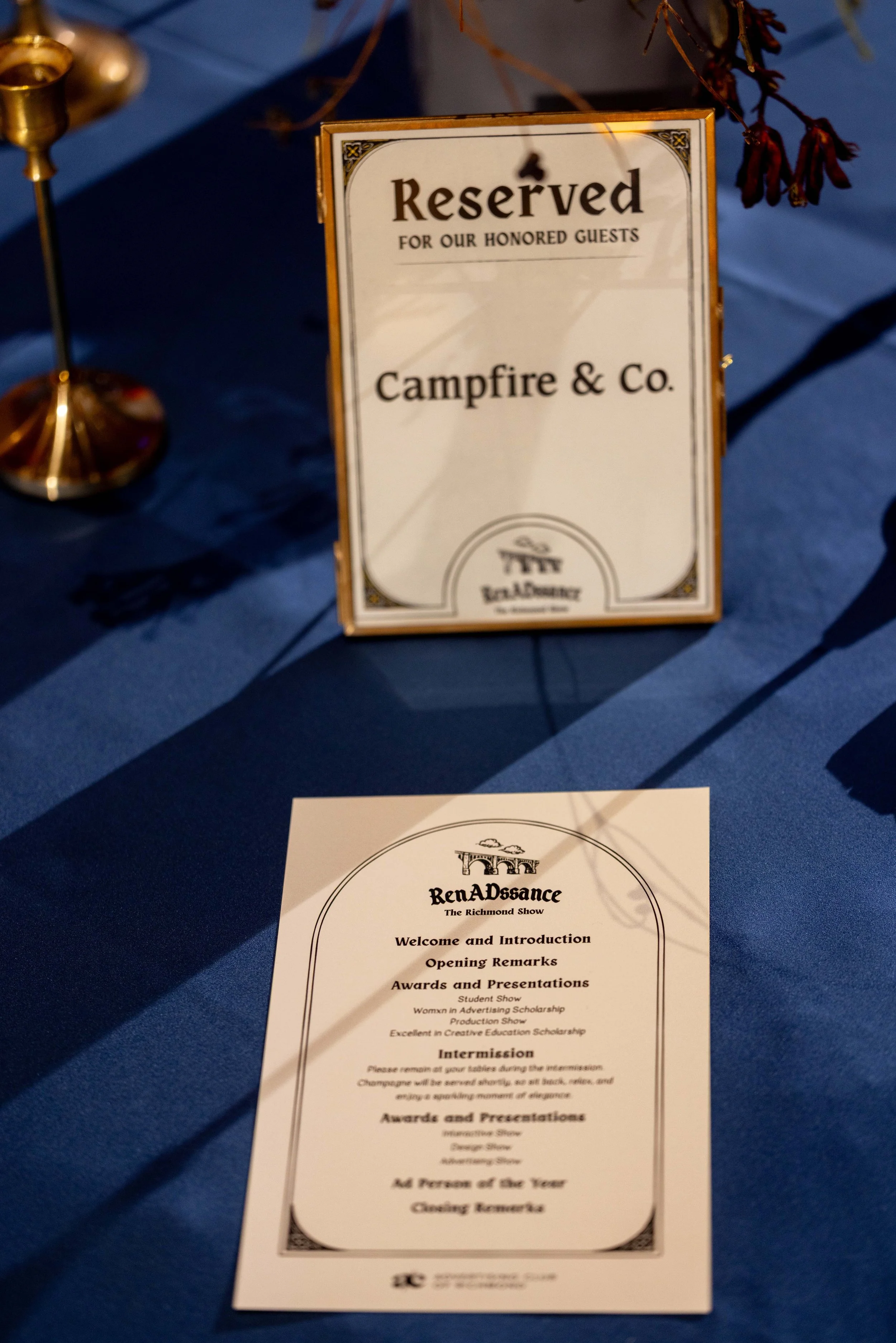
Our team attended the annual Richmond Show, bringing together creatives to celebrate their exceptional talent and hard work. Creative professionals and students submit work for judging in the Advertising Show, the Interactive Show, the Design Show, the Production Show, and Student Show.
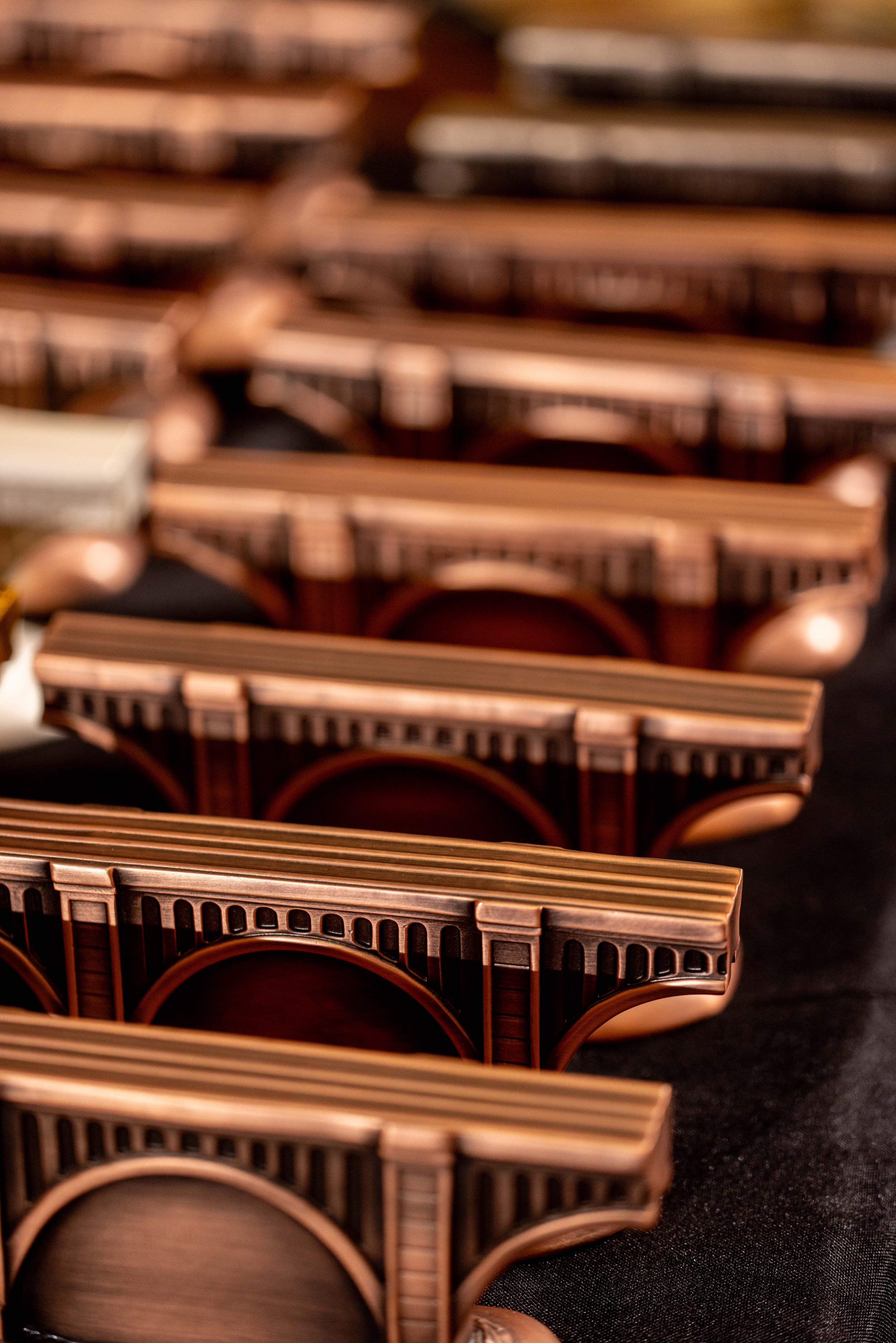
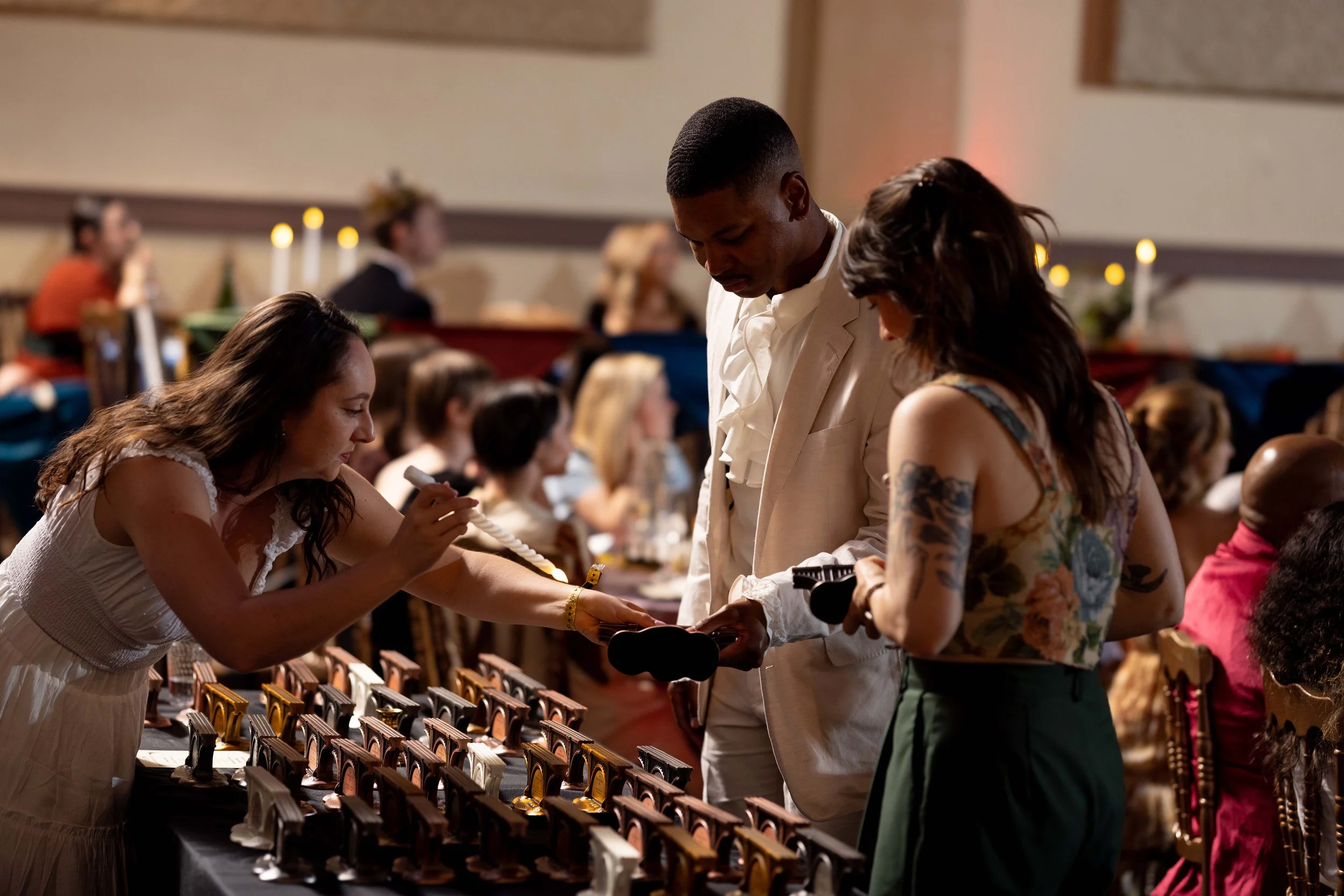
And now, on to the winners!
Silver Award, Branding
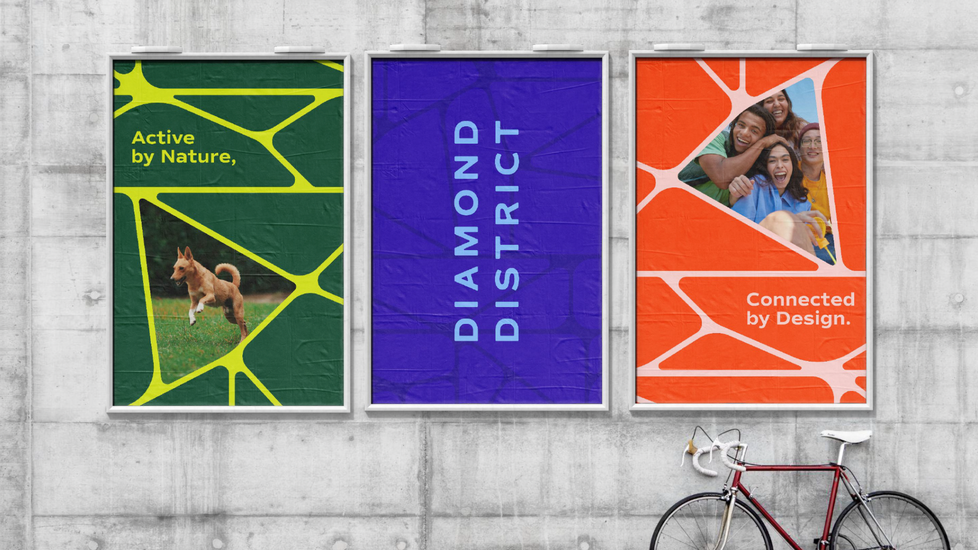
DIAMOND DISTRICT
The Diamond District is Richmond's sports and entertainment destination — a vibrant new 67-acre neighborhood in the heart of the city, anchored around a state-of-the-art ballpark. The brand mark draws its shape from the actual footprint of the neighborhood, with facet lines that create an icon reminiscent of a gem. That angular geometry carries through custom letterforms in the wordmark, while a bold, wide-ranging color palette and faceted pattern system reflect the diversity of the district itself. From street banners to branded merchandise, the identity is built to feel active, connected, and unmistakably Richmond.
Silver, Branding
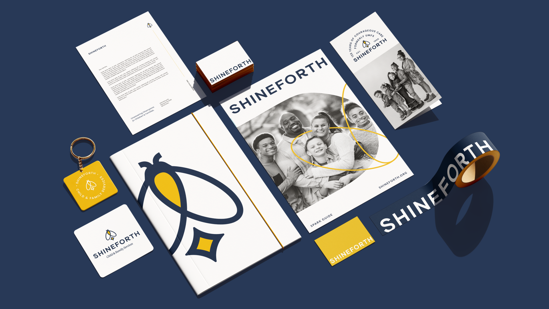
SHINEFORTH
Formerly UMFS, Shineforth has championed children and families for more than 125 years. A research-driven brand strategy process revealed that a new name would help the organization connect more deeply with existing audiences and broaden its reach. At the center of the new identity is a firefly — a familiar and beloved motif in the organization's history, reimagined as a symbol of empowerment and transformation. The firefly's wings subtly form a heart, honoring the legacy of the previous mark, while a golden spark at its core represents the light Shineforth helps every child and family uncover. The identity system spans collateral, signage, branded merchandise, and a billboard campaign across Virginia.
Bronze, Branding
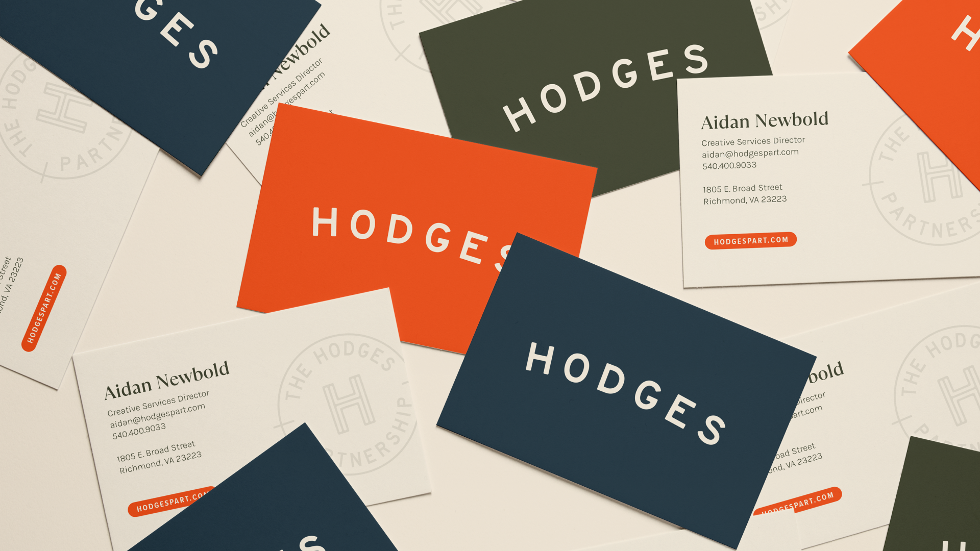
HODGES PARTNERSHIP
After more than 20 years in business, Hodges Partnership was ready for a brand refresh that fully reflected the energy, collaboration, and personality of their team. A move into a new office provided the opportunity to refine the brand in ways that felt more intentional, more connected, and more distinctly Hodges. The identity leans into the firm's long-standing connection to baseball — not as an overt theme, but as a thoughtful throughline woven into the brand and interior with maturity and purpose. Softened typography, a nostalgic warmth, and a rich color system give the updated identity a feeling that's fresh, refined, and unmistakably theirs.
Bronze, Branding
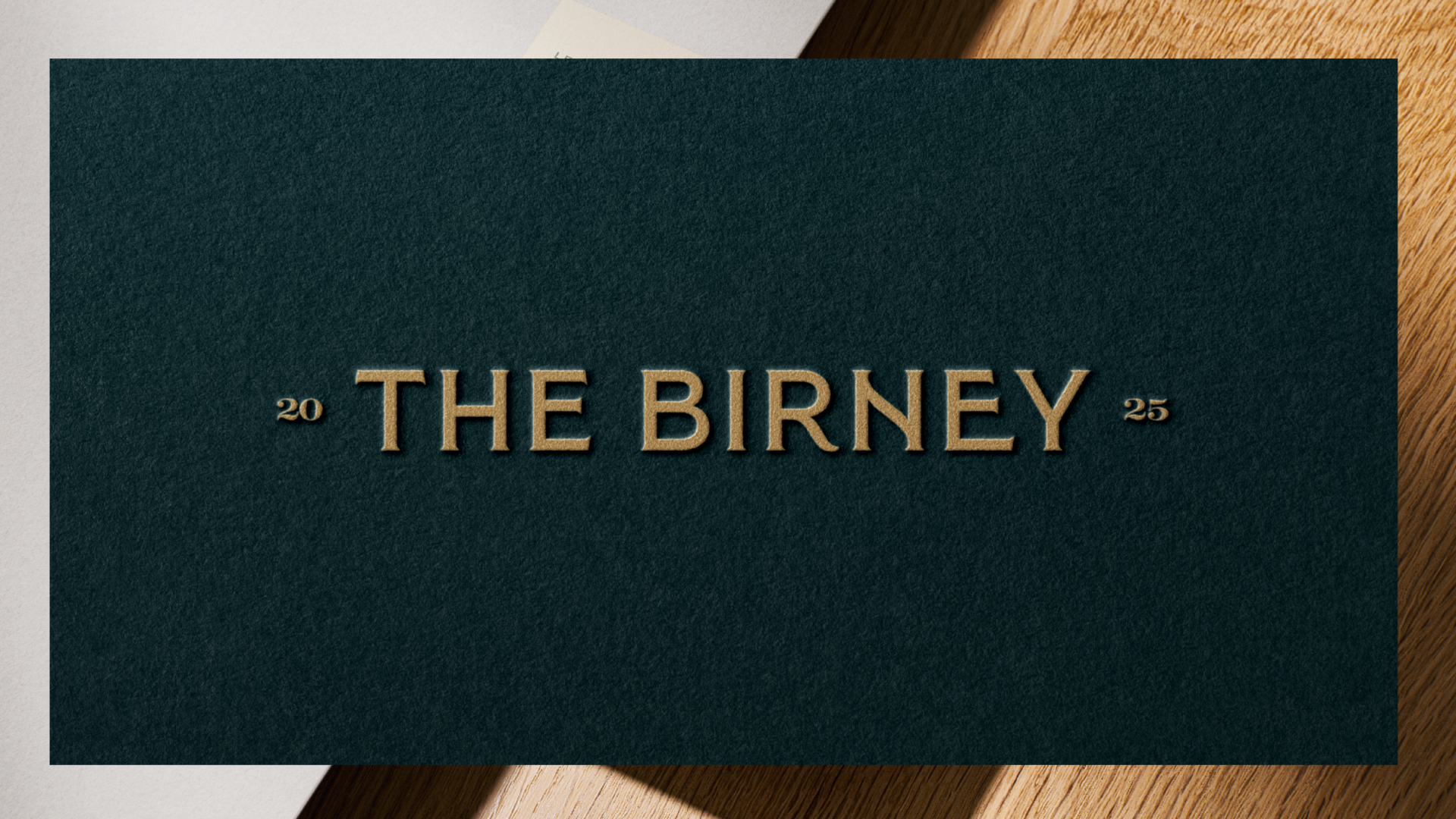
THE BIRNEY
The Birney at Westhampton Commons is a residential community designed with a strong sense of place, named for the Birney Safety Car — an electric streetcar that once operated in Richmond. The brand was built to reflect a timeless aesthetic honoring the Westhampton neighborhood's classic architecture and elevated details. A custom streetcar illustration anchors the secondary mark system, while refined type pairings and a color palette of deep teal, sage, and warm gold reinforce a feeling of sanctuary, elegance, and ease. From key fobs to building signage to the leasing office interior, every touchpoint is crafted to feel like home.