Hound Paint
SERVICES
Branding
Packaging Design
INDUSTRY
Retail
Hound Paint
Founded by a paint chemist who was tired of seeing big brands over-charge for sub-quality products, Hound Paint celebrates the power of paint with a premium quality formula at an accessible price.
Focused on millennials and new homeowners who are inspired to create a space they love but don’t always have access to large renovation funds, Hound Paint is inspiring creative DIY’ers to use paint to transform their world.
The new brand identity and packaging design is directly inspired by the team’s mission to encourage young and inexperienced DIY’ers to embrace the ease and impact of paint.
The main wordmark is paired with a vibrant color palette designed specifically to support a collection of paint can packaging designs.
A relationship focused brand, Hound Paint wants to help every customer find their perfect shade, feel comfortable sourcing and using the right tools, and try something new. In a sometimes intimidating field of construction, Hound Paint is the place where anyone can feel welcome and supported regardless of their goals or experience.
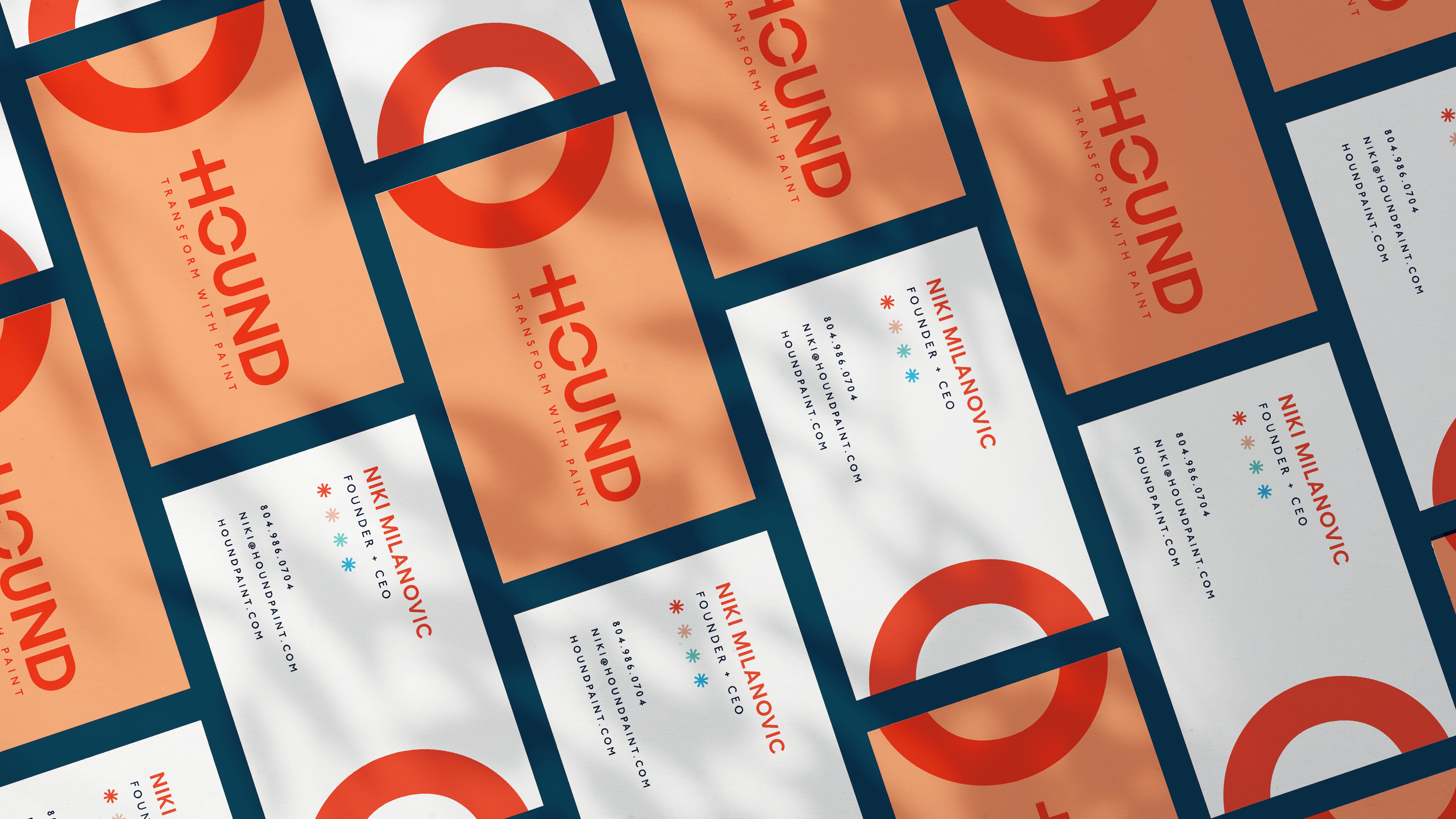
The main logo is impactful in its bold simplicity. Using a substantial sans serif typeface with customized H and O letters, it can stand on its own or within the context of vibrant colors and patterns. An elongated crossbar on the H pairs with negative space in the O to mimic the stroke of a paint roller. It’s subtle but distinctive, creating the illusion of movement and transformation. The HOUND work is paired with a vertical PAINT to provide clarity but allow the focus to be on HOUND for casual reference.


